Data Table Widget
Data Table Widget
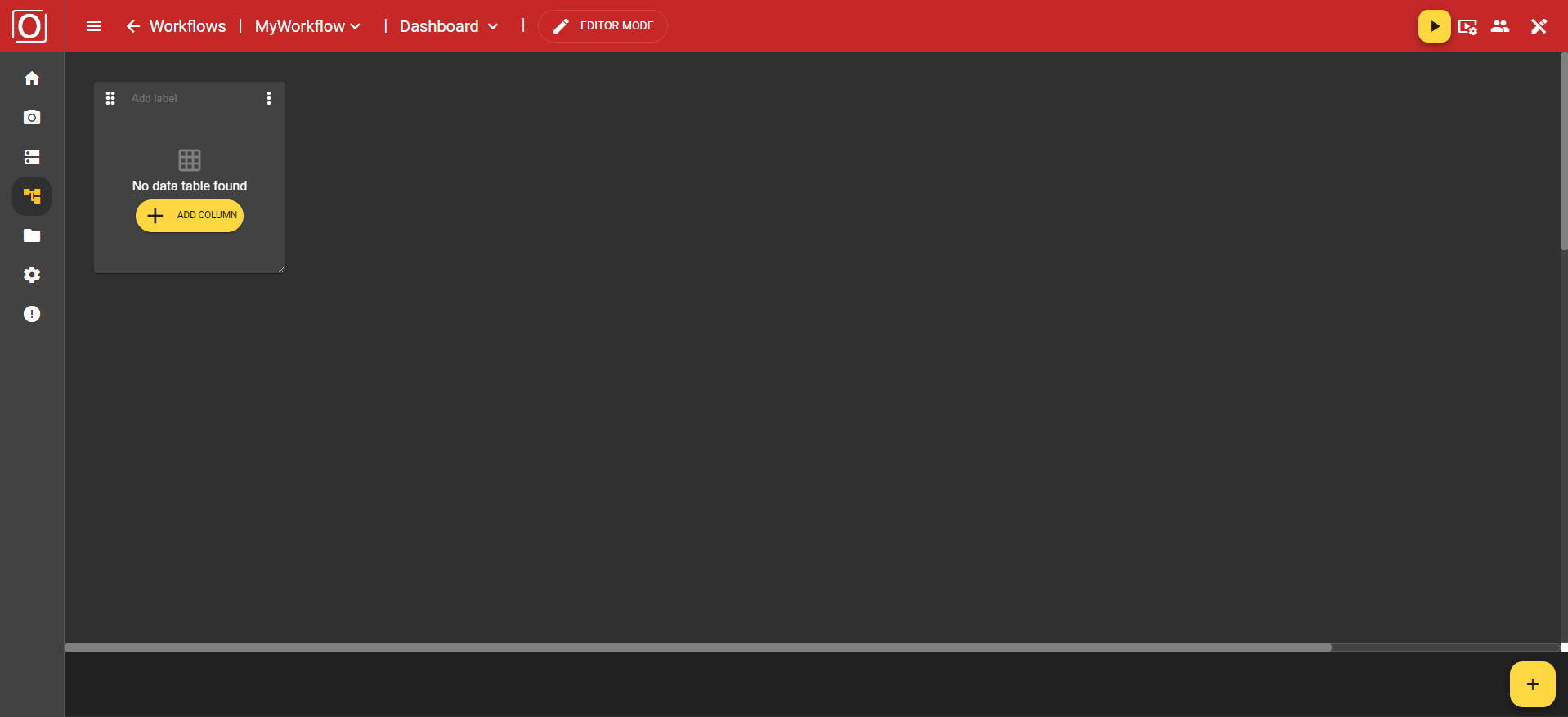
This widget allows you to display data in a table format. After adding the widget, it is initially empty and visually does not yet show many indications of a table. However, as soon as you start configuring your widget and click the yellow “Add Column” button, the table begins to take shape.
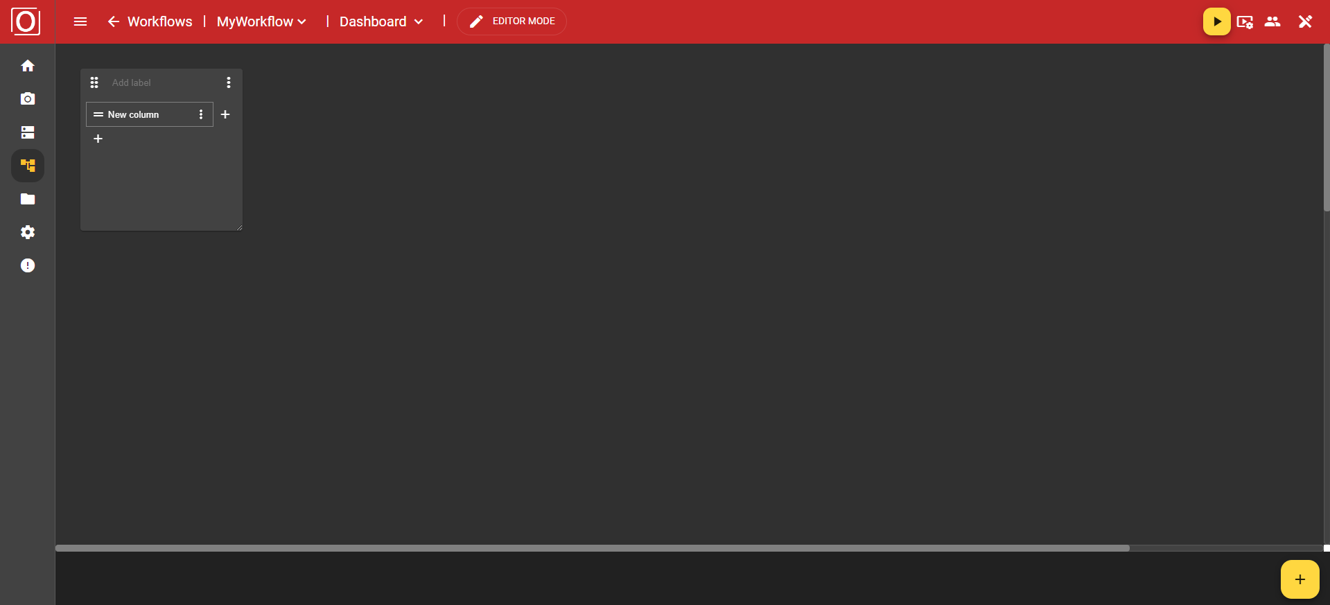
First, an initial column is created. This also serves as the header row. Here, you can not only add more columns but also additional rows. Additionally, through a column in the header row or its associated menu, it is possible to configure or specify the type of the column.
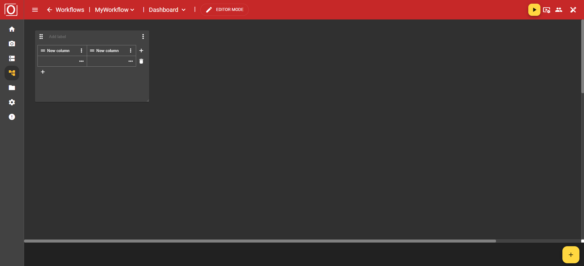
Once you have created a row, you can also remove it using the button with the "trash can" icon. To remove a column, you need to navigate to the "Remove" option in the header via the three-dot menu.
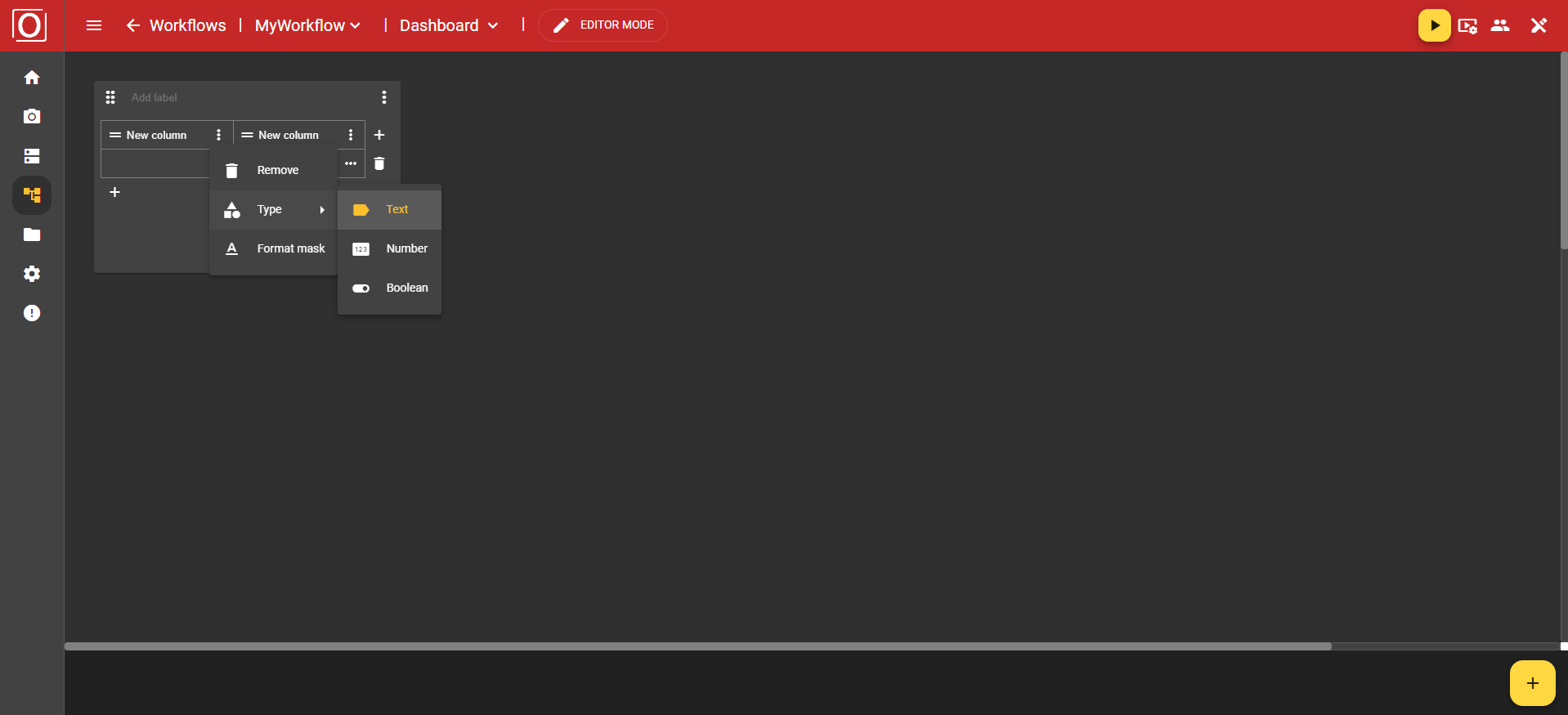
In the three-dot menu of the columns, you will find the options “Remove” to delete the column, “Type” to specify a type, and “Format mask”, which allows you to set the formatting of your values.
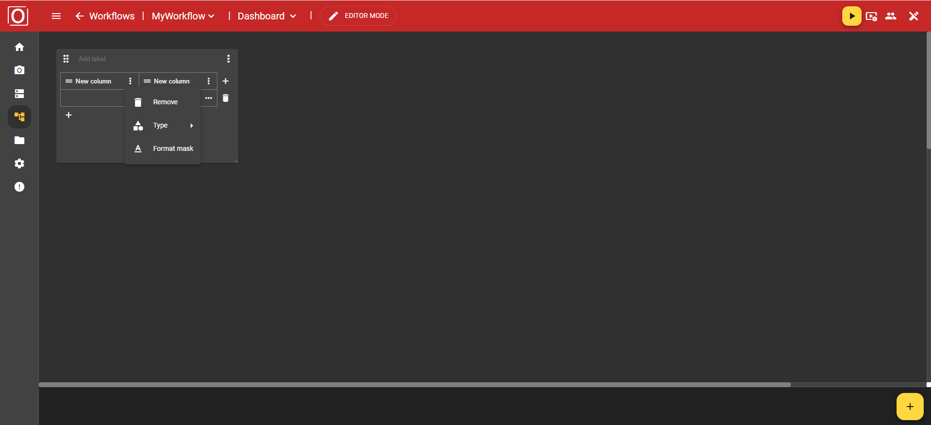
The "Type" option offers you the choices Text, Number, and Boolean.
If you have chosen the "Text" type, you can use the "Format mask" option to specify whether your text should be displayed as a single line using the value "Single-Line" or in a text box using the value "Textarea".

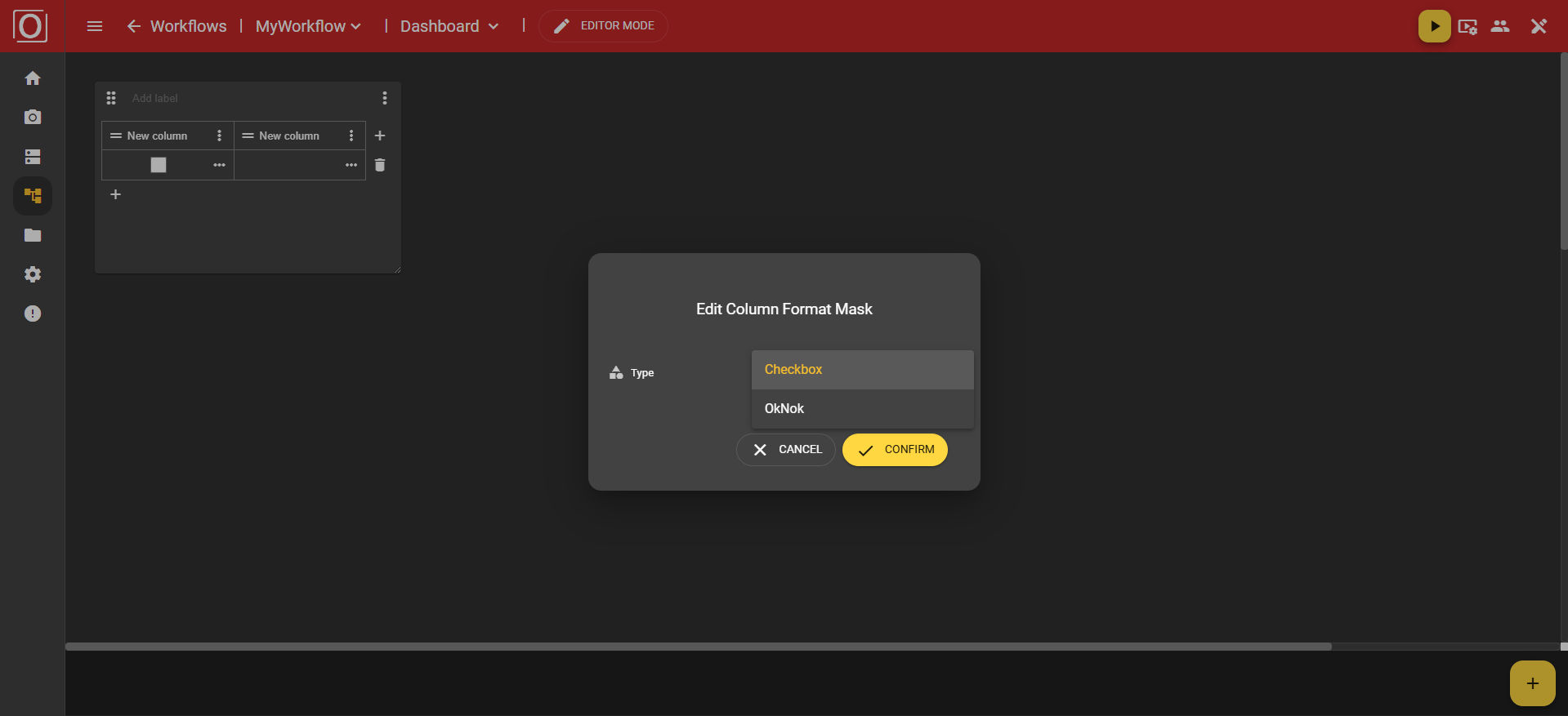
However, if you have chosen the type "Boolean", you can use the "Format mask" option to specify whether your data set is displayed as a checkbox via the value "Checkbox", or whether the information should be provided in text form via the value "OkNok".
You also have the option to configure a cell individually by, for example, linking a variable and thus setting it as context.
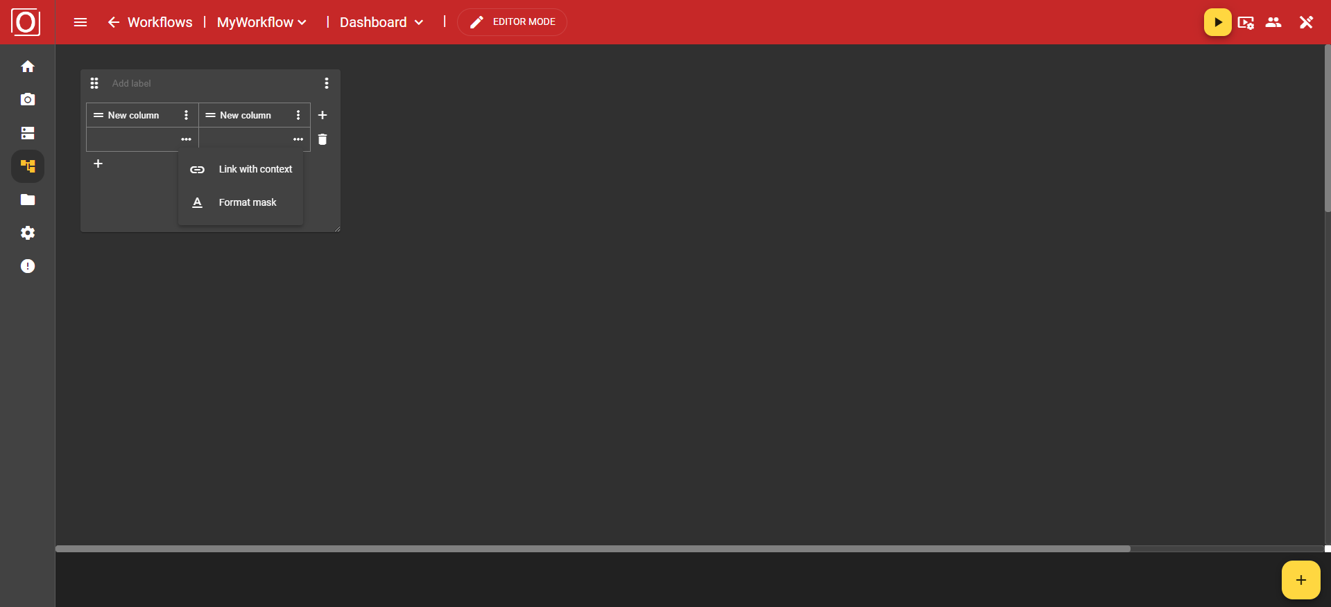
When you click on the "Link with context" option in the menu, the previously mentioned dialog titled "Link variable with context" appears. There, all variables of the boolean type are displayed, and you can activate exactly one for the widget via a checkbox. After selecting a variable, close the dialog by clicking the "Confirm" button.
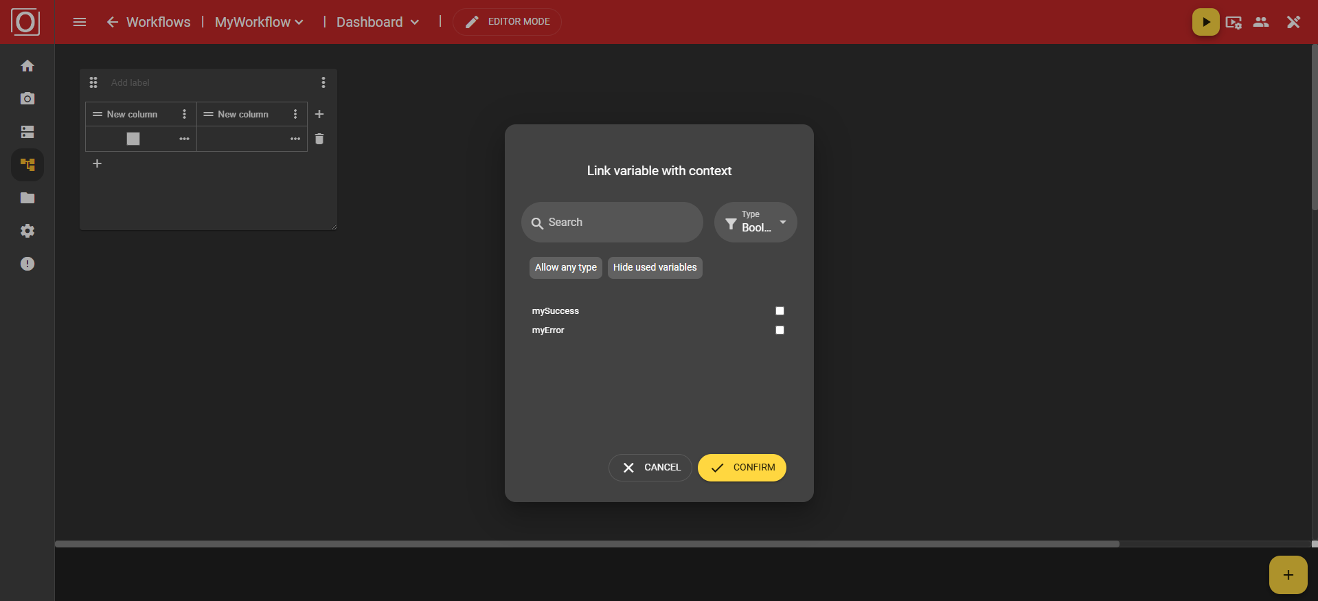
Once you have assigned a context to your widget, the cell will be filled with a value at the runtime of your workflow.