Dashboard
The dashboard is intended to make it possible to track the process flow and image processing on the evoVIU at a glance. Using various types of visualizations, information should be prepared in real time so that everyone is always aware of the current status.
Basically, the dashboard is prepared with the creation of a workflow but is empty. However, you can bring the dashboard to life with just a few clicks, ideally by linking your dashboard widgets with variables from your workflow.
Widgets
We will roughly outline the central tasks of the available widgets at the beginning. We will go into the details at a later point.
Alert
Displays the states Error, Pending, and Success of a variable of type boolean in the form of a box colored red, yellow, or green.
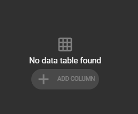
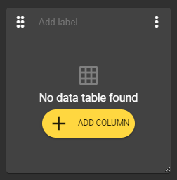
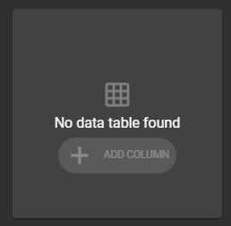
Data Table
Enables the display of different values in tabular form.
iFrame
Allows you to embed a webpage.
Image
For example, visualizes the most recently captured image of your workflow, provided you have assigned the most recently captured image to a variable.
Label
Is excellent for providing individual sections of your dashboard with a short, concise description.
Text
This widget can be filled with any text. Numerous formatting options are available to format the text.
Variant Control
Here you can change the set variant at runtime.
Variant Editor
Allows you to adjust the values of individual parameters of your variant at runtime. This way, you can track the effects of your changes in real time without having to stop and restart the workflow. The changes automatically take effect with the next iteration of the workflow.
Event Trigger
With this widget, events in the workflow can be triggered during runtime via the dashboard.
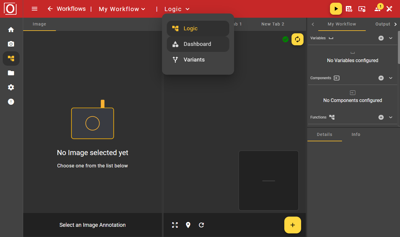
The Overview Page
Call of the overview page
In the menu bar, you can click on "Logic" and switch to the dashboard via the dropdown menu.
You arrive at the overview page of the dashboard. As mentioned earlier, the overview is initially empty. At the top of the screen, you see the red-colored Top App Bar for navigation within the workflow area. There, you can also control your workflow, configure the display settings of your screen, and much more, just as you are used to from other areas of the application. Before we get started, let's briefly discuss the view and edit modes, which you may have already noticed in the Top App Bar.
Dashboard Modi
Currently, two modes are available for using the dashboard:
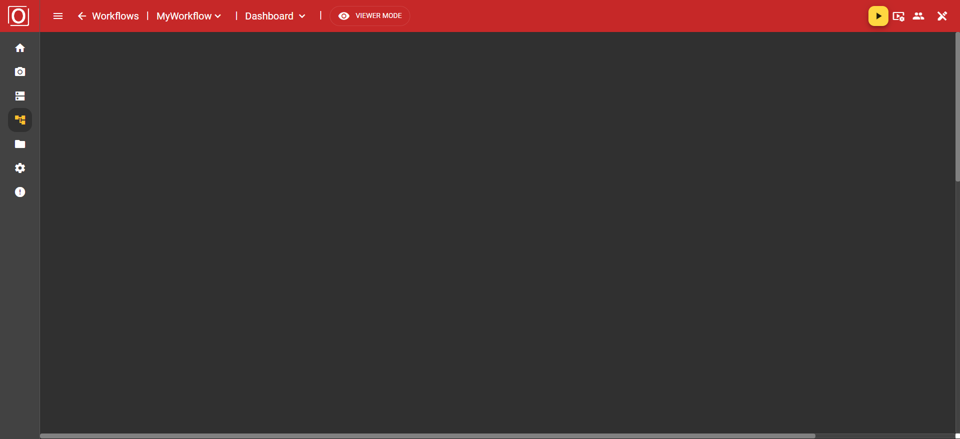
Viewer Mode
Editor Mode
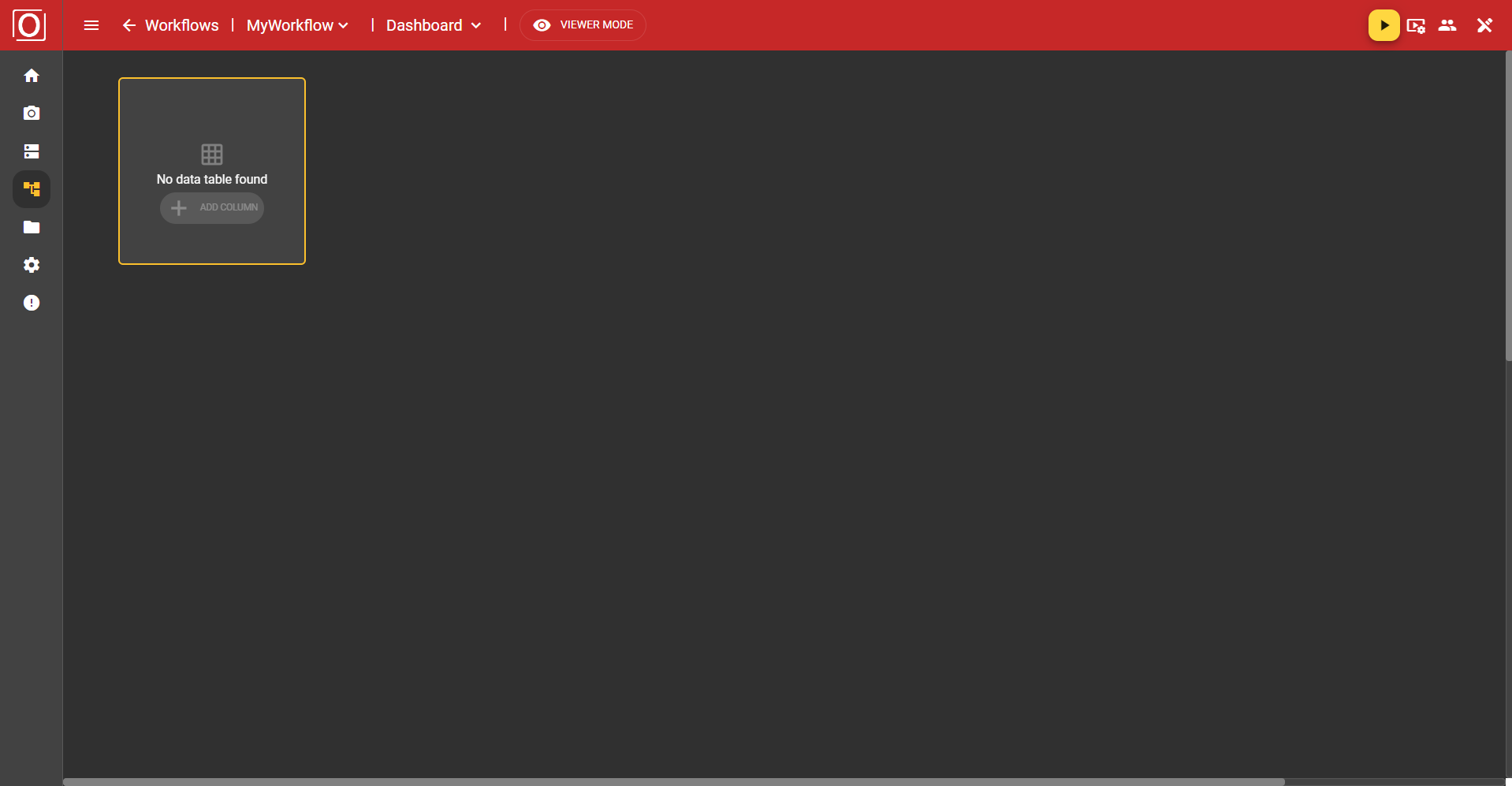
Initially, the dashboard is always opened in Viewer Mode. This display mode is limited to the essentials, showing you everything worth knowing at a glance and preventing unwanted misconfigurations. However, as soon as you click the “Viewer Mode” button, you switch to Editor Mode. Here, the Bottom App Bar appears at the bottom of the screen, which you might already know from the Image Source or other areas of the application.
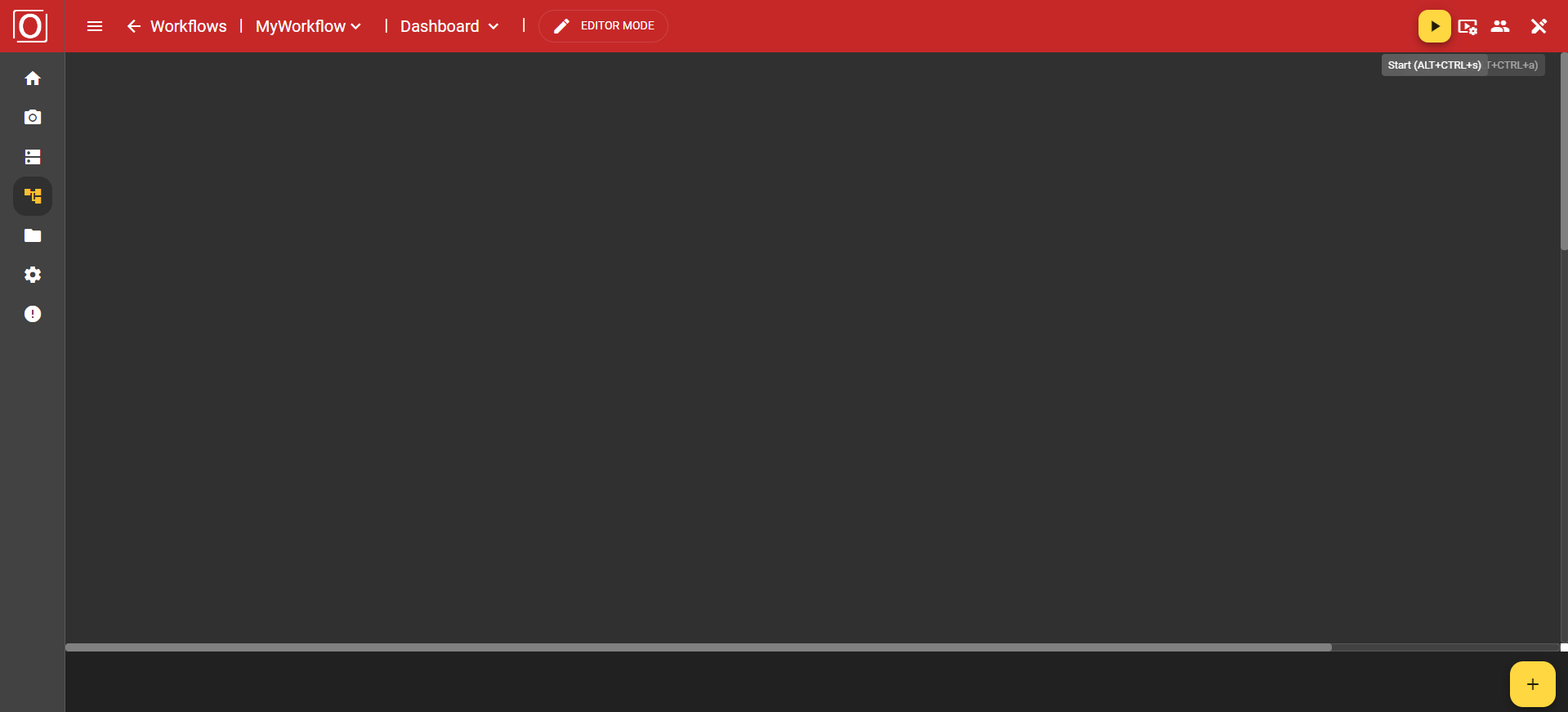
Adding a Widget
You can add so-called widgets via the yellow button with the plus icon in the bottom app bar, which are responsible for visualizing data. First, a dialog opens listing all available widget types. By clicking an entry, you ensure that the widget is added to your dashboard.
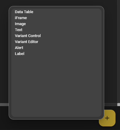
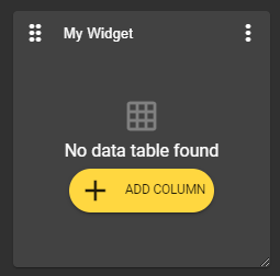
In our first example, we choose the Data Table Widget. This is placed on the canvas and filled with content. Basically, there is always a bar at the top of the widget, which contains a button to move the widget, a text field for assigning a label, and a menu with additional options and settings related to the widget.
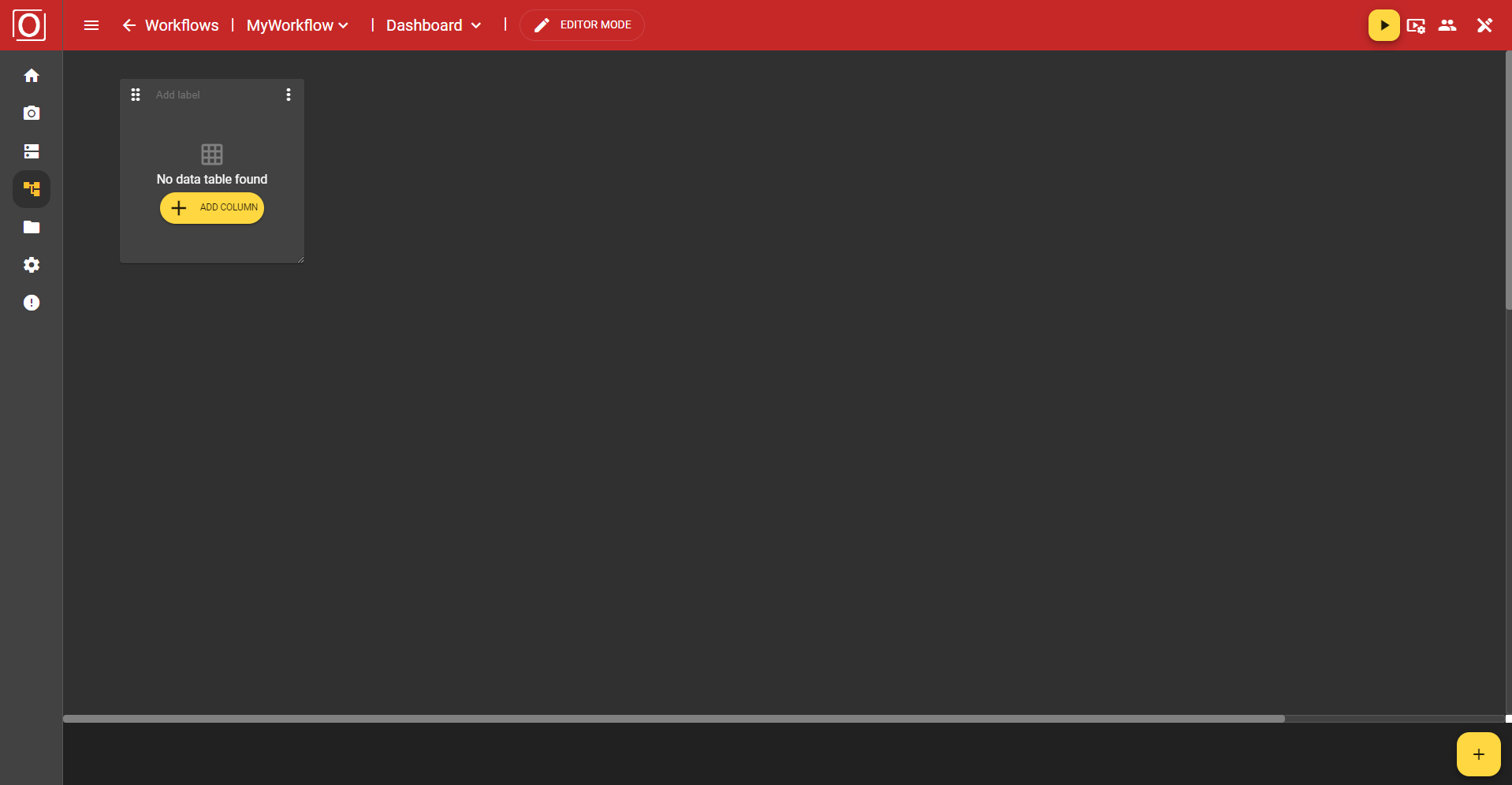
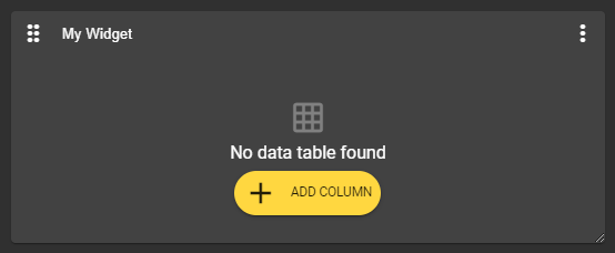
It is important to know that these configuration options are only available in Editor Mode. When you view the dashboard in Viewer Mode, all configuration options are either hidden or grayed out. Additionally, you can also select an already existing widget. This will then receive a yellow border to visualize the selection.
Moving the Widget
In the top left corner of the widget, there is an icon with 6 dots. If you press and hold this button, you can move the widget to any position. It will automatically snap to the grid.
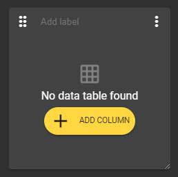
Labeling the Widget
In the middle at the top edge of the widget, there is a text field that allows you to label the widget. However, assigning a label is not mandatory and can also be left empty.
Enlarge / Reduce the Widget
In the bottom right corner of the widget, there is an icon with 2 diagonal lines. If you press and hold this button, you can freely enlarge or reduce the size of the widget. Your widget can take on any proportions.
General Configuration Options
Widget Menu
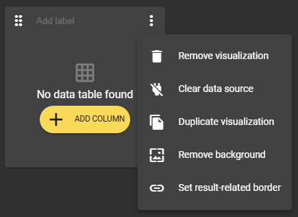
You can open a menu via the three-dot menu in the upper right corner of the widget. There you will find several options for managing and configuring the current widget.
Removing the Widget
The three-dot menu in the top right corner of the widget provides the option "Remove Visualization." This option removes the widget you have selected.
Clear Data Source
With the "Clear data source" option, you can remove linked variables, the so-called context, and reset your widget to its original state.
Duplicating the Widget
There is also the option to duplicate the widget. This way, you can create pre-filled widgets in no time.
Edit Background Color
Once you have added a widget, it always contains a background color. However, through the widget's menu, you can use the option “Remove background” to create a “transparent” background. If you want to undo this setting, simply use the widget's menu again. The option now reads “Set background” and restores the original state.
 |  |
|---|---|
Widget without background in editor mode | Widget without background in viewer mode |
 |  |
Widget with background in editor mode | Widget with background in Viewer Mode |
Setting Outcome-Based Framework
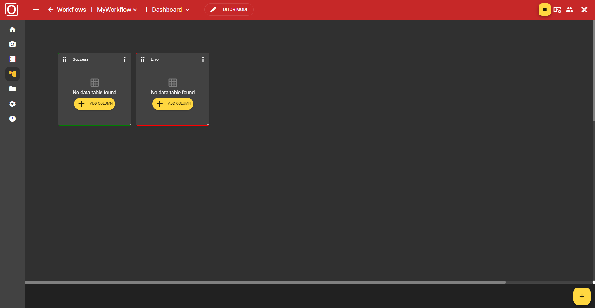
To use this feature, you must enable the “Publish value” setting for at least one boolean variable in your workflow.
In the three-dot menu in the upper right corner of the widget, the option “Set result-related border” is available to you. This allows you to display a visual result indicator in the form of a red, yellow, or green colored border. All that is required for this is the selection of a variable of type boolean.
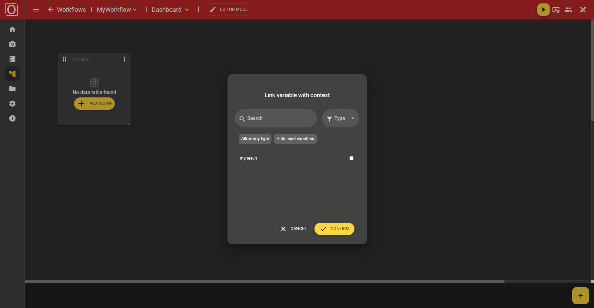
If you want to make this setting, a dialog will open listing all the matching variables. You can use the search function, choose a specific type, or also hide variables that have already been used. By clicking the “Confirm” button, you confirm your selection, the dialog will close, and the setting will be applied. As soon as the next run takes place, the widget's frame will be colored accordingly.