Component Status Widget
Component Status Widget
With the Component Status Widget, you can monitor the connection status of a selected workflow component directly on the dashboard. The widget shows at a glance whether a component is currently reachable or not—and updates in real-time without requiring a page reload. This makes the widget especially suitable for monitoring critical connections, such as to cameras or PLC controllers.
Adding the Widget
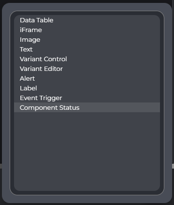
Add the "Component Status" widget to the dashboard using the "Add" button. If necessary, first switch to Editor Mode. In the dialog for selecting the widget type, you will find the entry "Component Status" at the end of the list.
Empty State
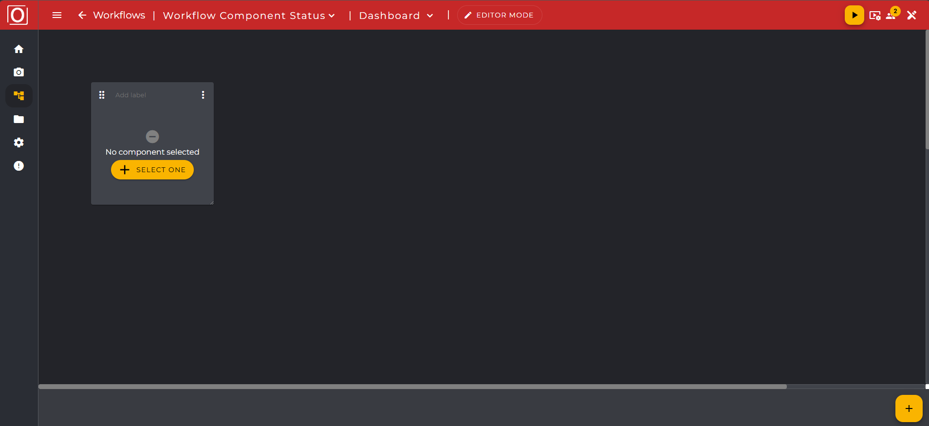
After adding, the widget will initially be displayed in an empty state. You will see the message "No component selected" along with a yellow button labeled "SELECT ONE". You can use this button to open the selection dialog to assign a component.
Selection of a Component
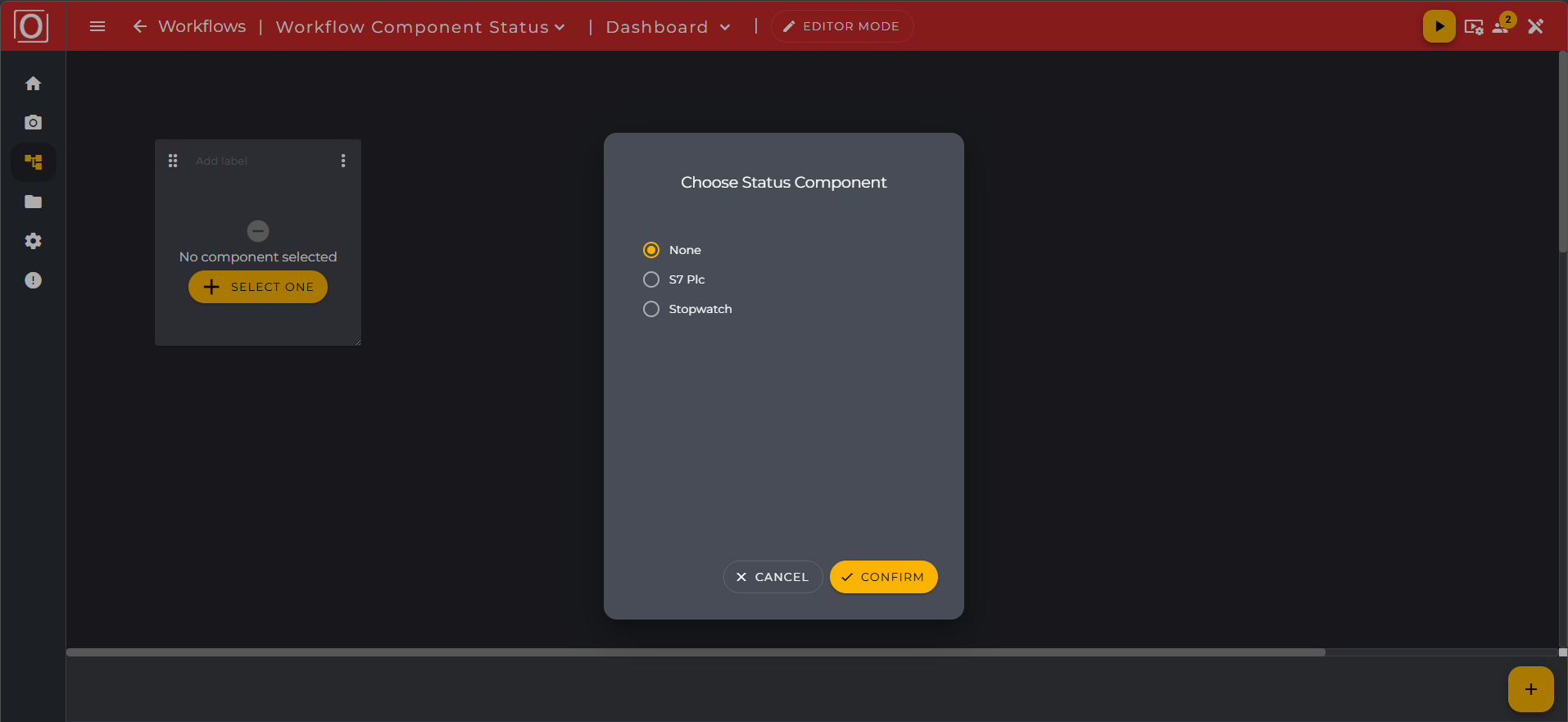
When you click the "SELECT ONE" button, the "Choose Status Component" dialog opens. This dialog only displays components that support a status (so-called "status-capable" components). The list is dynamically loaded from your workflow.
You can select exactly one component from the list by activating the corresponding radio button. Confirm your selection with the "CONFIRM" button or cancel the process with "CANCEL." When reopening the dialog, the last saved selection is preselected.
If there are no status-capable components in your workflow, a corresponding message will be displayed in the dialog.
Status Display
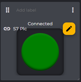
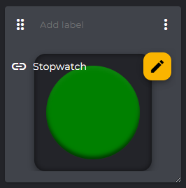
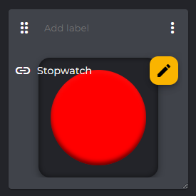
Once you have selected a component, the widget displays its current connection status. The status is visualized by a color-coded circle:
Color | Status | Meaning |
|---|---|---|
Green | Available | The component is connected and active. Additionally, the text "Connected" is displayed. |
Red | Not available | The component is not reachable or the connection was interrupted. |
Gray | Unknown | The status could not be loaded or there is an error. |
Next to the color wheel, the name of the selected component is displayed (e.g., "Stopwatch" or "S7 Plc"). You can reopen the selection dialog at any time and choose a different component by clicking the yellow button with the pencil icon.
Live Updates
The status display of the widget updates automatically in real-time as soon as the connection status of the selected component changes. Manual page reload is not necessary. The visual representation is updated within one second after a status change occurs.
Notes
Connection loss: If the connection is briefly interrupted, the last known status along with the color display remains visible. After the connection is restored, all missed status changes in the meantime are reloaded and the display is updated accordingly.
Warning for longer interruption: If the connection is interrupted for more than 30 seconds, the widget displays a notice that the displayed data may not be current.
Error state: If an invalid or unknown status is received, the widget displays a defined error state in the form of a gray color display and an error message.