Dashboard
The dashboard should make it possible to track the process flow and image processing on the evoVIU at a glance. Using a wide variety of visualization types, information should be processed in real time so that everyone is always aware of the current status.
The dashboard is basically set up with the creation of a workflow, but it is empty. However, you can fill the dashboard with life in just a few clicks, ideally by linking your dashboard widgets to variables from your workflow.
Widgets
We will begin by providing a general overview of the main functions of the available widgets. We will go into more detail at a later stage.
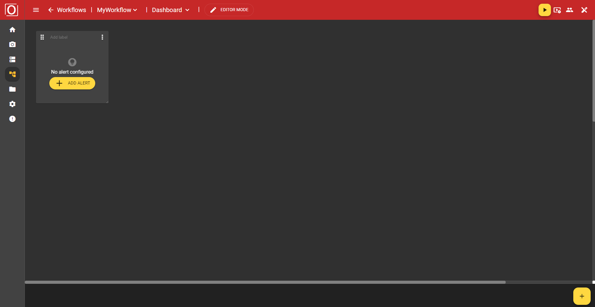
Alert
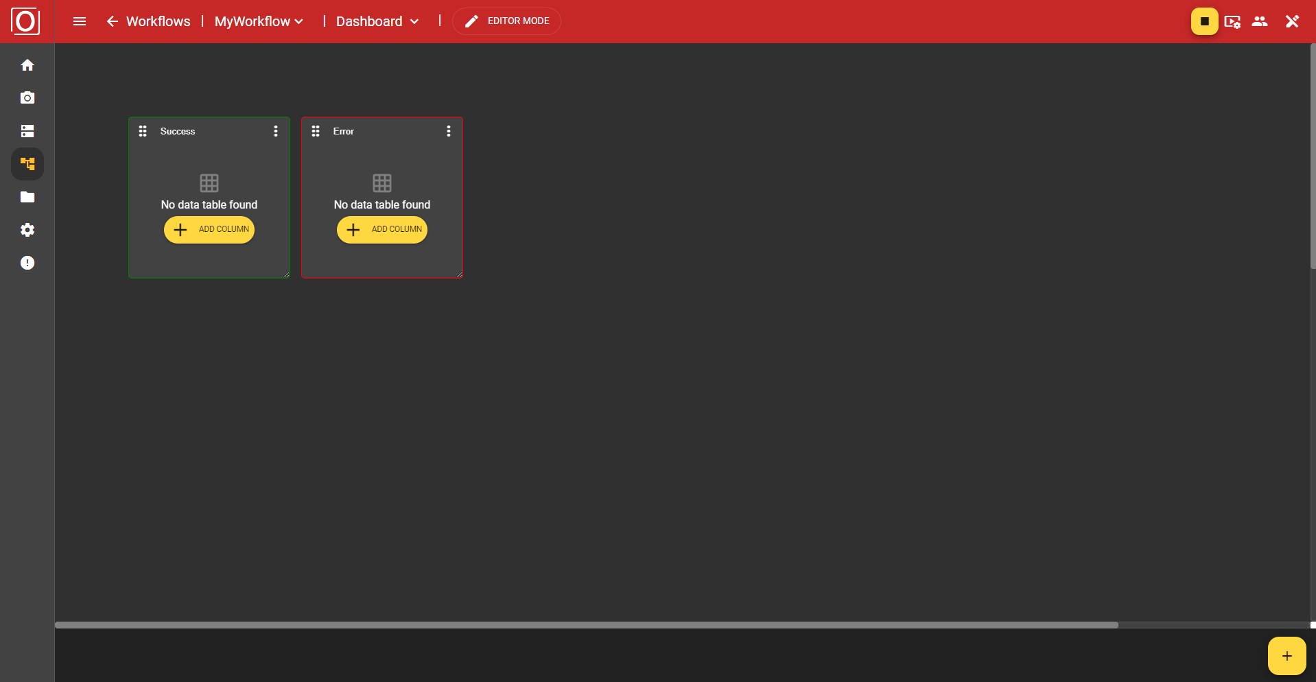
Displays the Error, Pending, and Success statuses of a boolean variable in the form of a red, yellow, or green box.
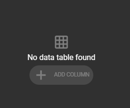
Data Table
Enables the display of different values in table form.
iFrame
Allows you to embed a website.
Image
Visualizes, for example, the last image captured in your workflow, provided you have assigned the last captured images to a variable.
Label
Ideal for providing individual sections of your dashboard with a short, concise description.
Text
This widget can be filled with any text. There are several formatting options available for formatting the text.
Variant Control
Here you can change the set variant at runtime.
Variant Editor
Allows you to adjust the values of individual parameters of your variant at runtime. This allows you to see the effects of your changes in real time without having to stop and restart the workflow. The changes take effect automatically with the next iteration of the workflow.
The overview page
Calling up the overview page
In the menu bar, you can click on “Logic” and switch to the dashboard via the drop-down menu.
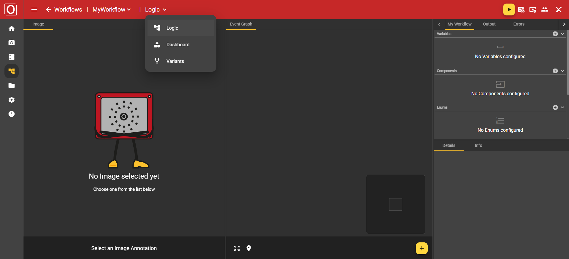
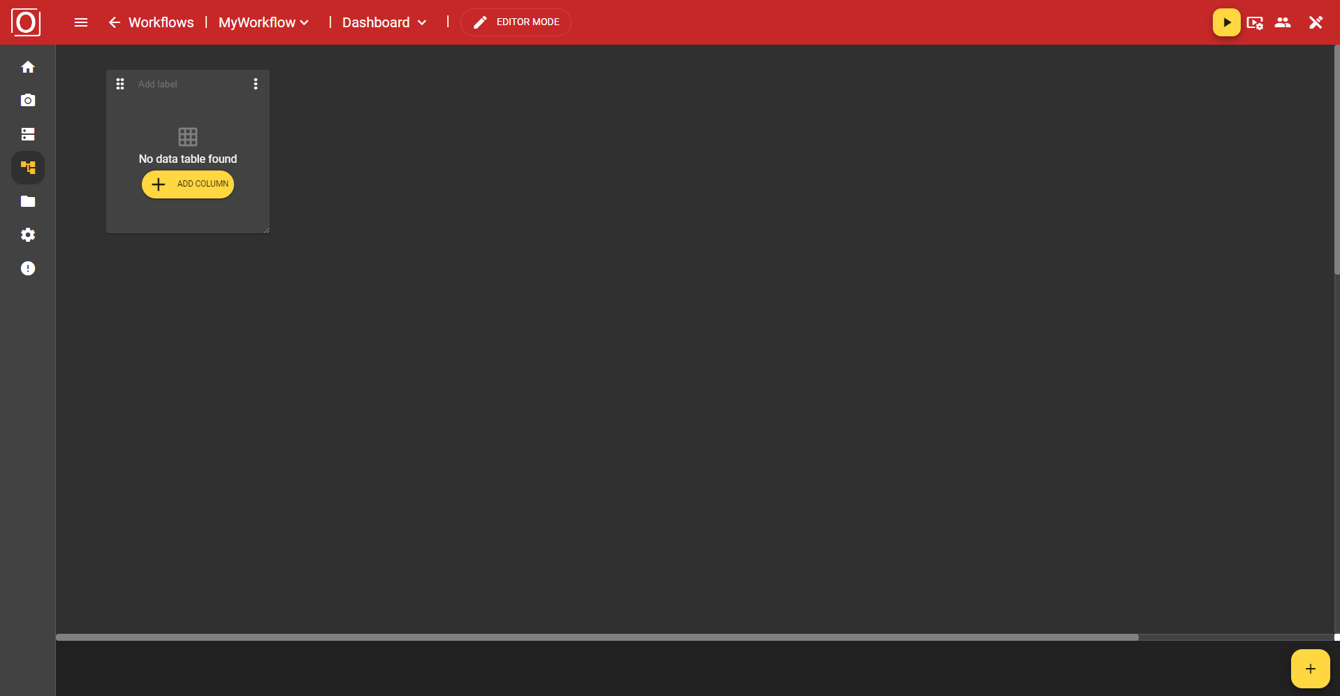
You will be taken to the dashboard overview page. As already mentioned, the overview is initially empty. At the top of the screen, you will see the red Top App Bar for navigation within the workflow area. There you can also control your workflow, configure the display settings for your image, and much more, just as you are used to doing in other areas of the application. Before we get started, let's briefly discuss the view and edit modes, which you may have already noticed in the Top App Bar.
Dashboard Modes
There are currently two modes available for using the dashboard:
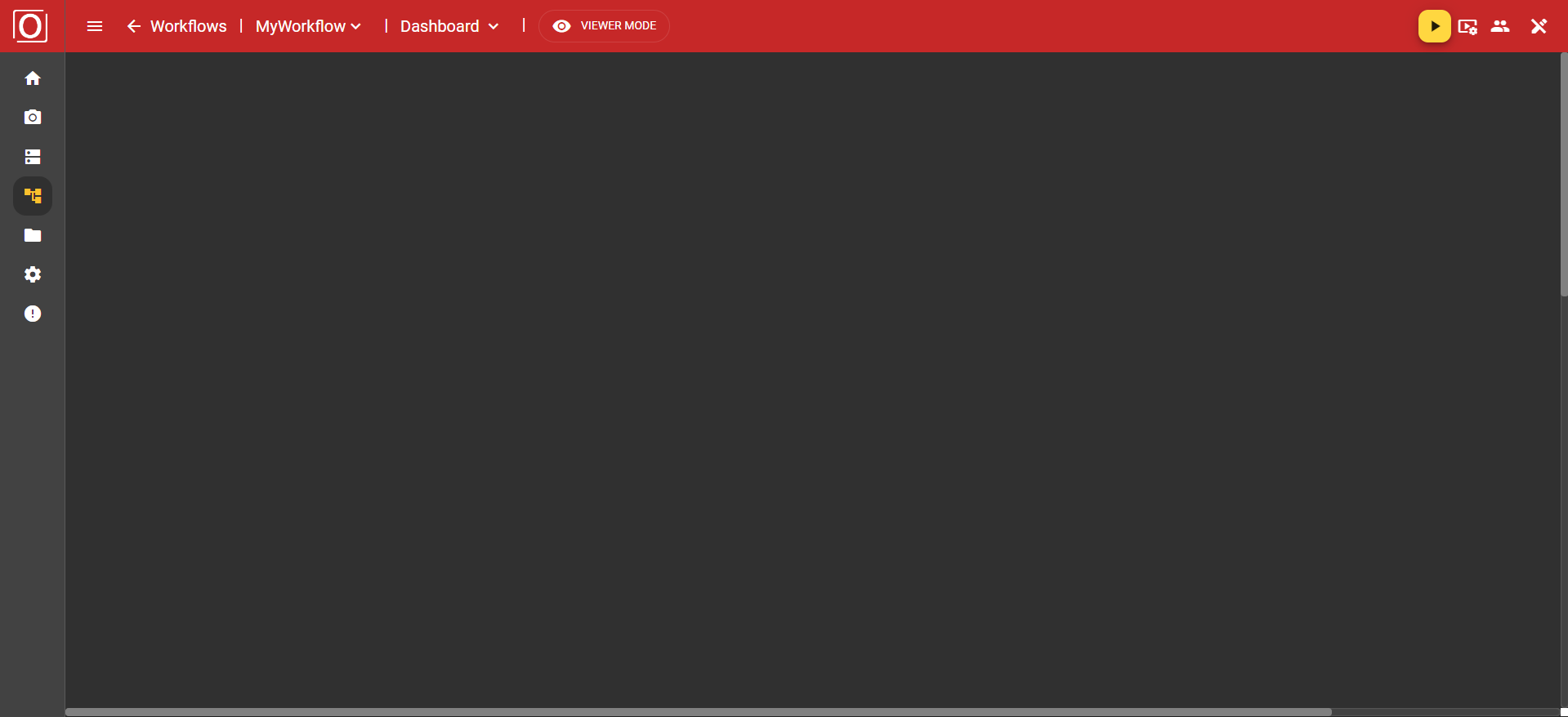
Viewer Mode
Editor Mode
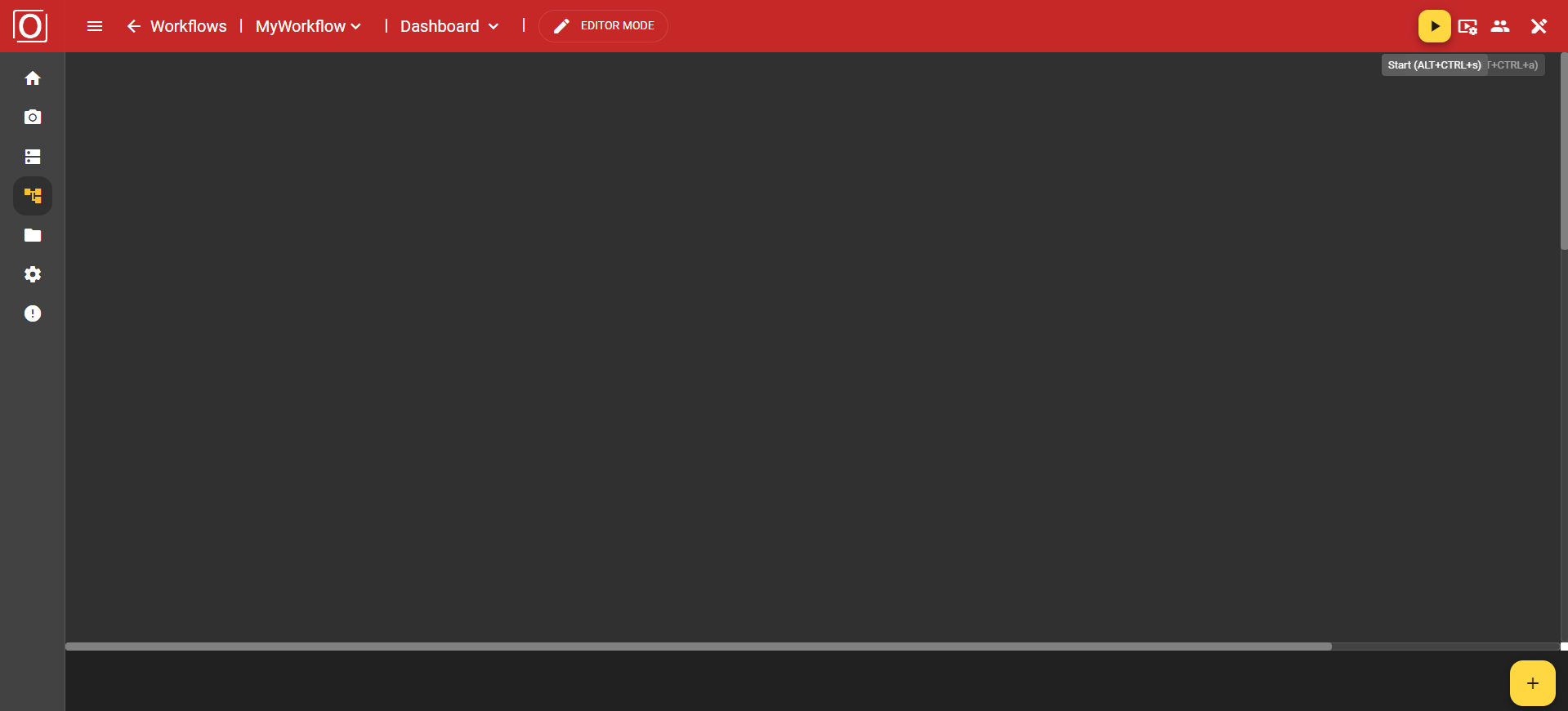
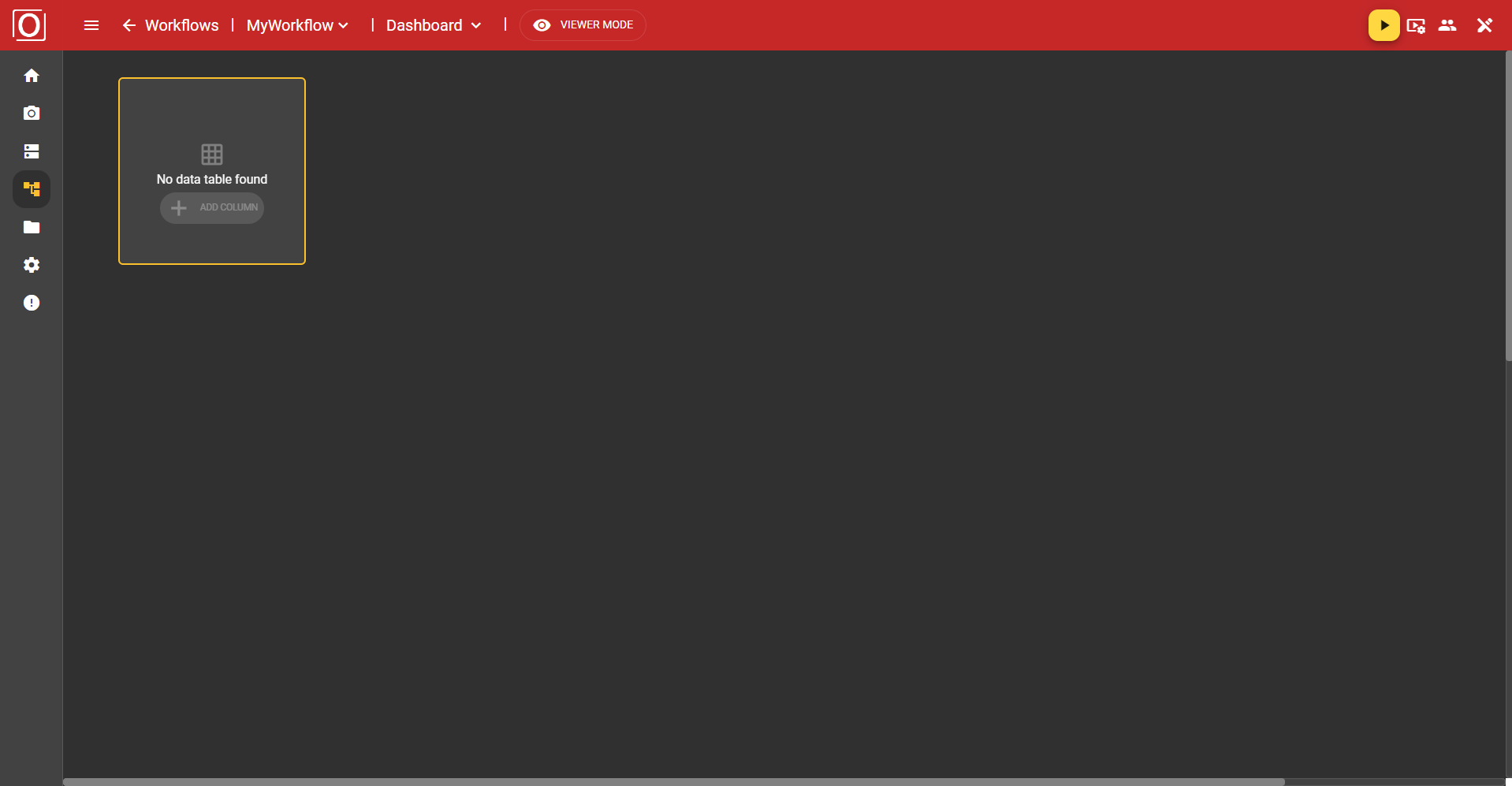
Initially, the dashboard is always opened in Viewer Mode. This display mode is limited to the essentials, shows you everything you need to know at a glance, and prevents unwanted misconfigurations. However, as soon as you click on the “Viewer Mode” button, you switch to Editor Mode. Here, the Bottom App Bar appears at the bottom of the screen, which you may already be familiar with from Image Source or other areas of the application.
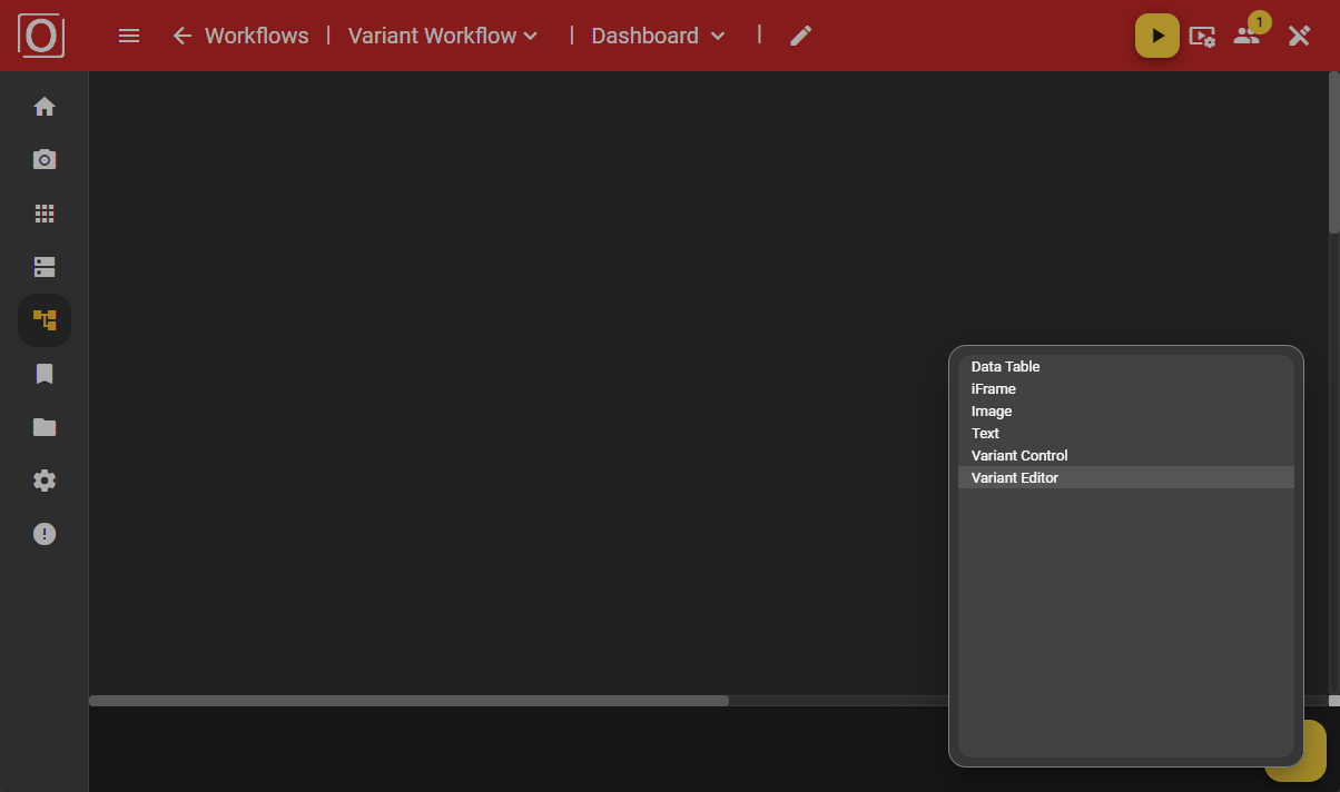
Adding a widget
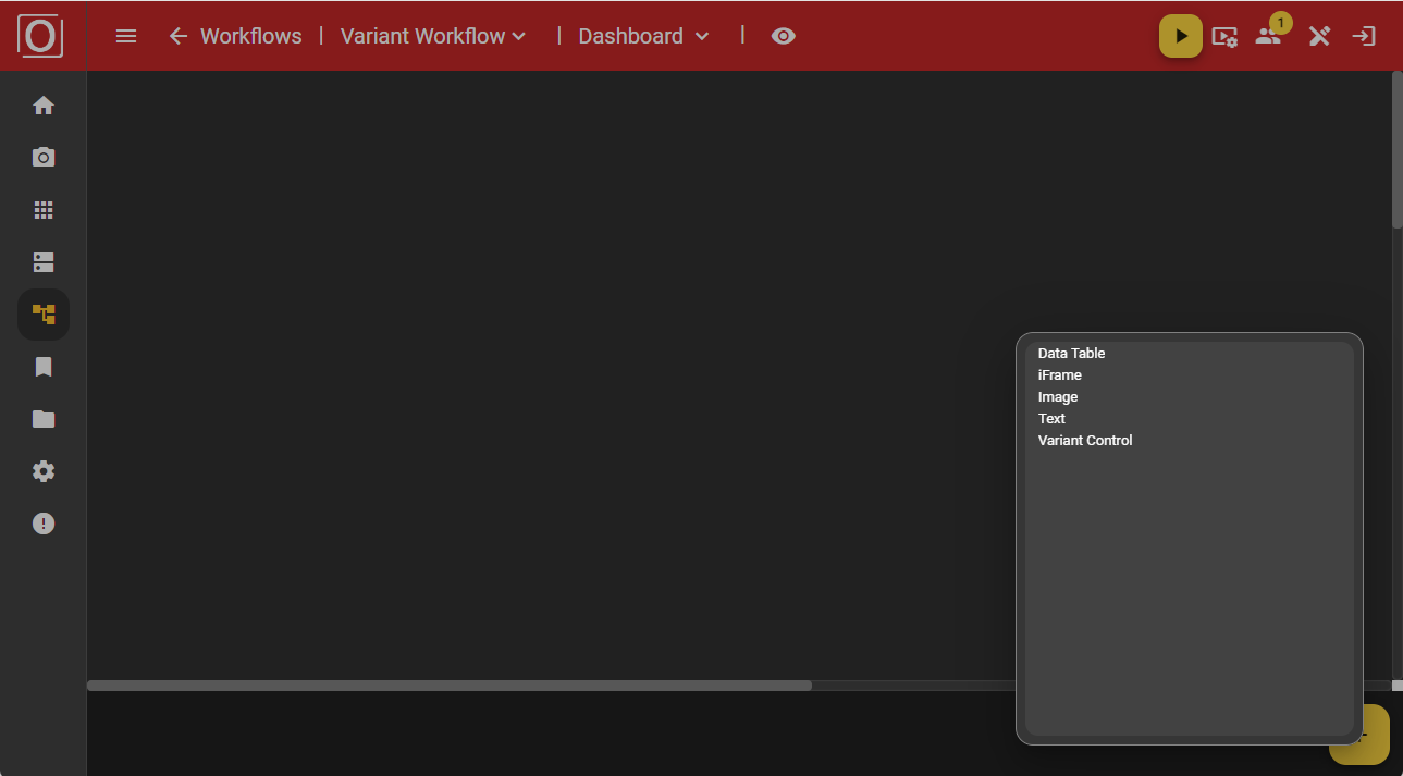
You can add widgets, which are responsible for visualizing data, using the yellow button with the plus icon in the bottom app bar. First, a dialog box opens listing all available widget types. By clicking on an entry, you add the widget to your dashboard.
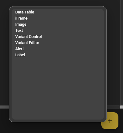
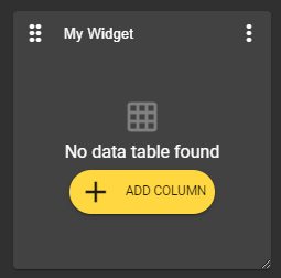
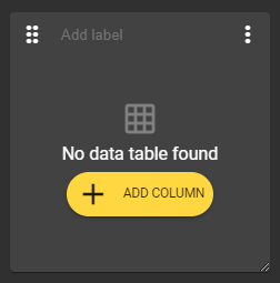
In our first example, we choose the Data Table widget. This is placed on the drawing area and filled with content. At the top of the widget, there is always a bar with a button for moving the widget, a text field for assigning a name, and a menu with additional options and settings related to the widget.
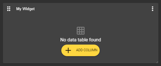
It is important to note that these configuration options are only available in Editor Mode. If you view the dashboard in Viewer Mode, all configuration options will be hidden or grayed out. You can also select an existing widget. This will then be highlighted with a yellow frame to indicate that it has been selected.
Moving the widget
In the upper left corner of the widget, there is an icon with 6 dots. If you hold down this button, you can move the widget to any position. It will automatically align with the grid.
Labeling the widget
There is a text field at the top center of the widget that allows you to label the widget. However, assigning a label is not mandatory and can be left blank.
Enlarging/reducing the size of the widget
In the lower right corner of the widget, there is an icon with two diagonal lines. If you hold down this button, you can enlarge or reduce the size of the widget as desired. Your widget can be resized to any proportions.
General configuration options
Widget menu
You can open a menu using the three-dot menu in the upper right corner of the widget. There you will find several options for managing and configuring this widget.
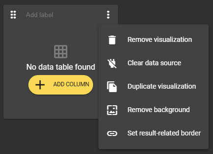
Removing the widget
The “Remove Visualization” option is available via the three-dot menu in the upper right corner of the widget. This option removes the widget you have selected.
Clearing the data source
The “Clear data source” option allows you to remove linked variables, known as context, and reset your widget to its original state.
Duplicating the widget
There is also an option to duplicate the widget. This allows you to create pre-filled widgets in no time at all.
Editing the background color
Once you have added a widget, it always has a background color. However, you can use the “Remove background” option in the widget menu to create a ‘transparent’ background. If you want to undo this setting, simply use the widget menu again. The option is now called “Set background” and restores the widget to its original state.
 |  |
|---|---|
Widget without background in editor mode | Widget without background in viewer mode |
 | |
Widget with background in editor mode | Widget with background in viewer mode |
Set a results-oriented framework
To use this feature, you must activate the “Publish value” setting for at least one variable of type boolean in your workflow.
The three-dot menu in the upper right corner of the widget provides you with the option “Set result-related border.” This allows you to display results visually in the form of a red, yellow, or green border. All you need to do is select a variable of type boolean.
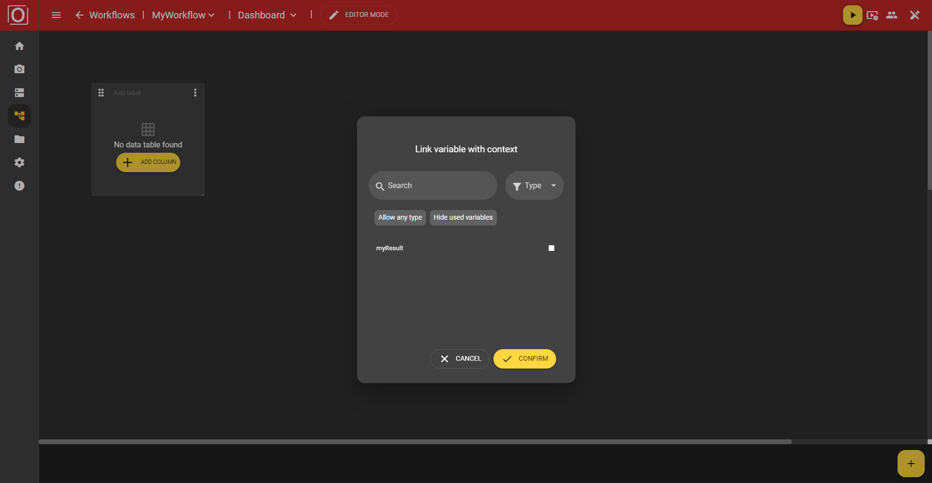
When you select this setting, a dialog box opens listing all matching variables. You can use the search function, select a specific type, or hide variables that have already been used. Click the “Confirm” button to confirm your selection, close the dialog box, and set the setting. The next time the widget runs, its frame will be colored accordingly.
Alert Widget
To use the variants you configured earlier in the workflow, you must add a Get Variable node to the graph and connect the output to the input of another node that is to use the values of the variant. Please note that you must add a node whose variable has been marked for the variants.
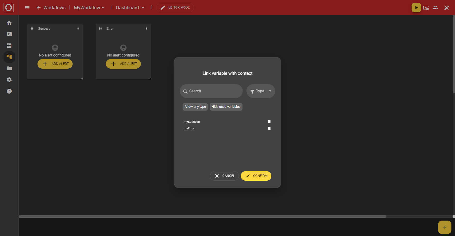
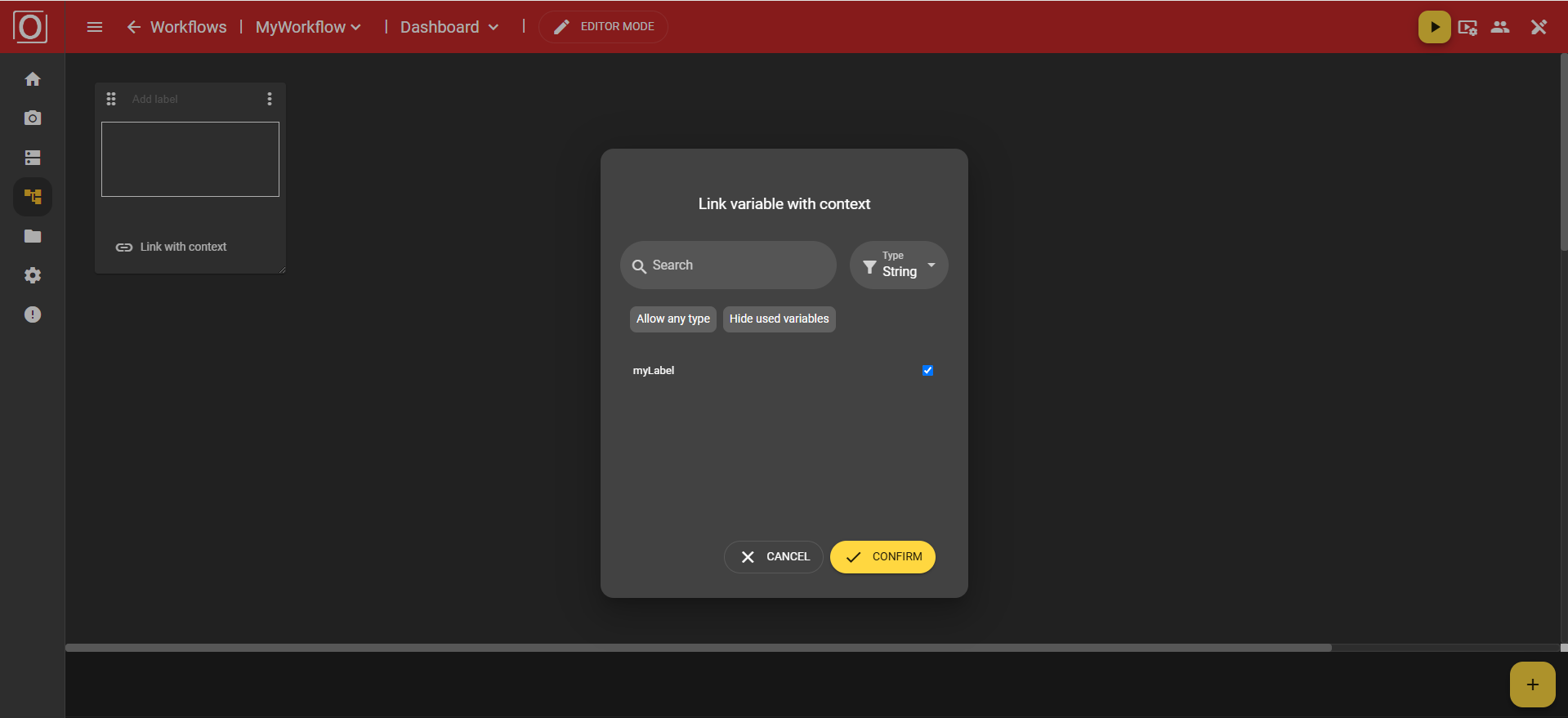
The alert widget is designed to place greater emphasis on displaying results. The status can be identified more quickly than with the result-related frame color. When you click on the “Add Alert” button, the previously mentioned dialog box with the title “Link variable with context” appears. All variables of the boolean type are displayed there, and you can activate exactly one of them for the widget using a checkbox. After selecting a variable, close the dialog box by clicking the “Confirm” button.
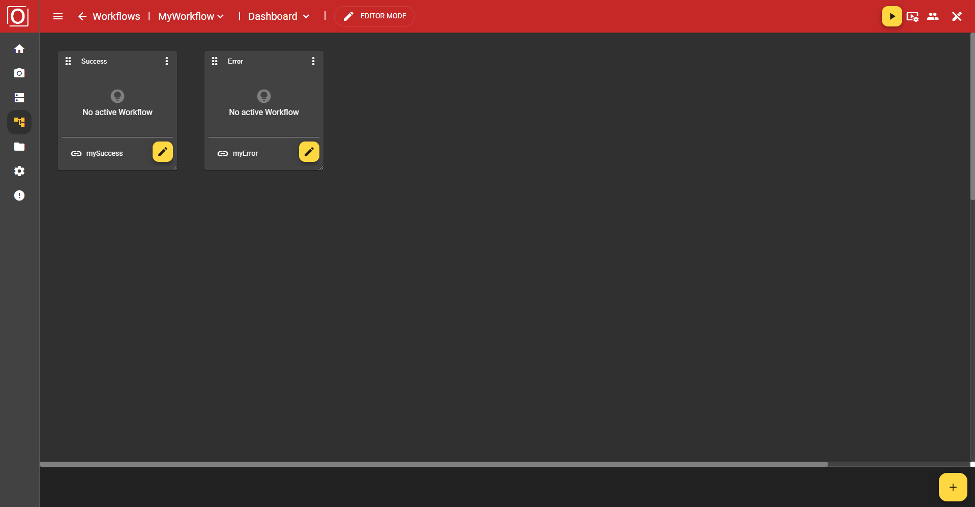
Once you have assigned a context to your widget, the view of your widget will change. Not only will you see a changed message, but instead of the “Add Alert” button, you will see a new bar that contains the name of the selected variable and a yellow button with a pencil icon. Both clicking on the button and the name of the selected variable allow you to edit your selection.
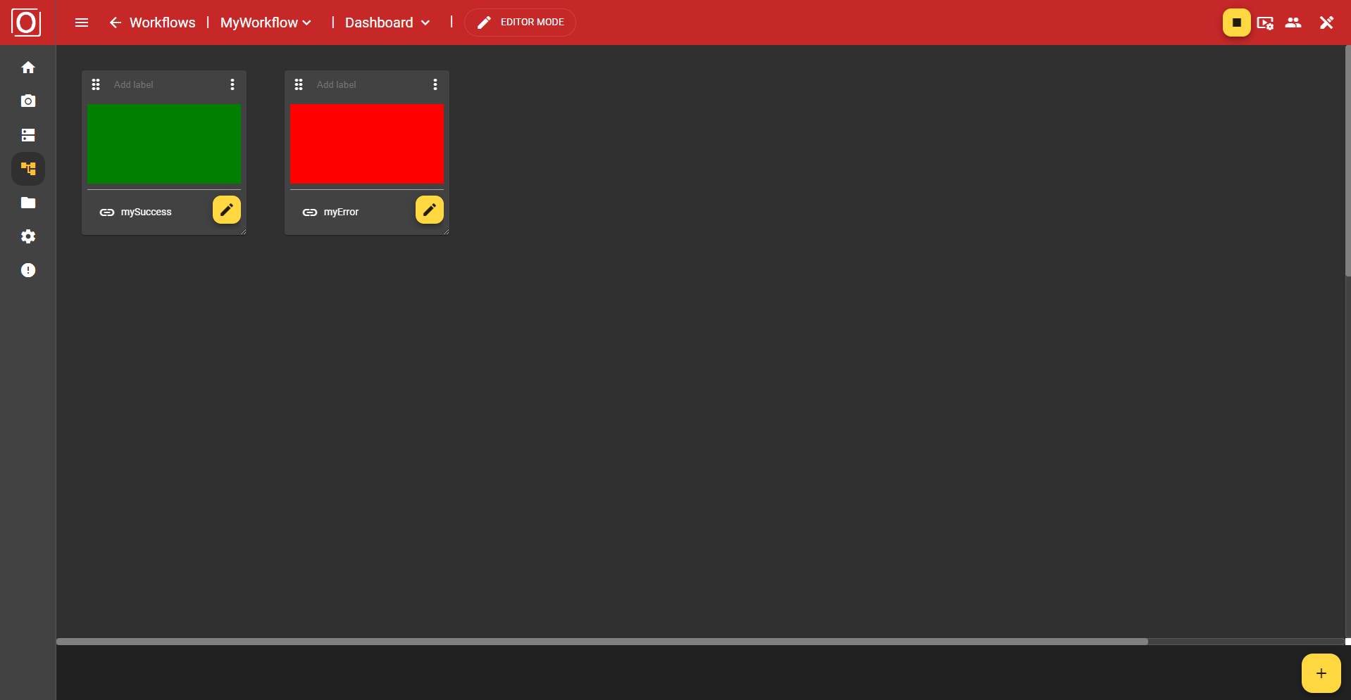
Now that your alert widget has been fully configured, you can start the workflow. If successful, the widget content will be filled in green; if unsuccessful, it will be filled in red. If no value is available yet, it will be filled in yellow.
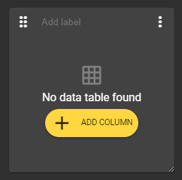
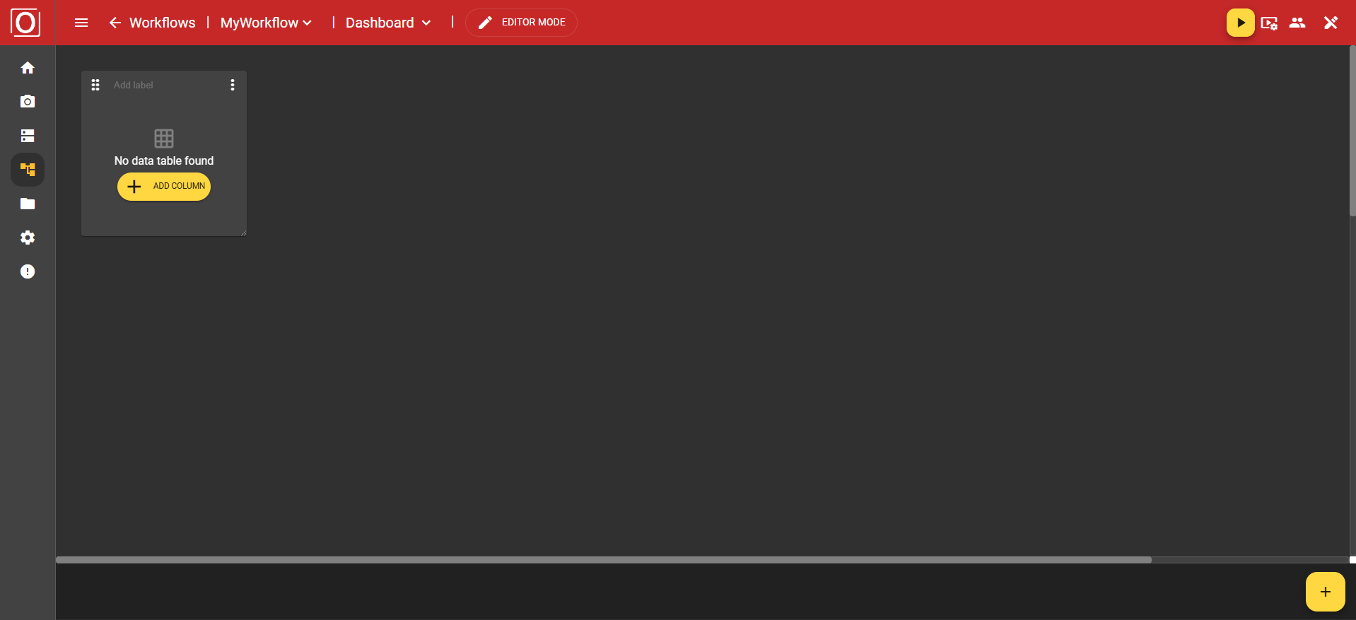
Data Table Widget
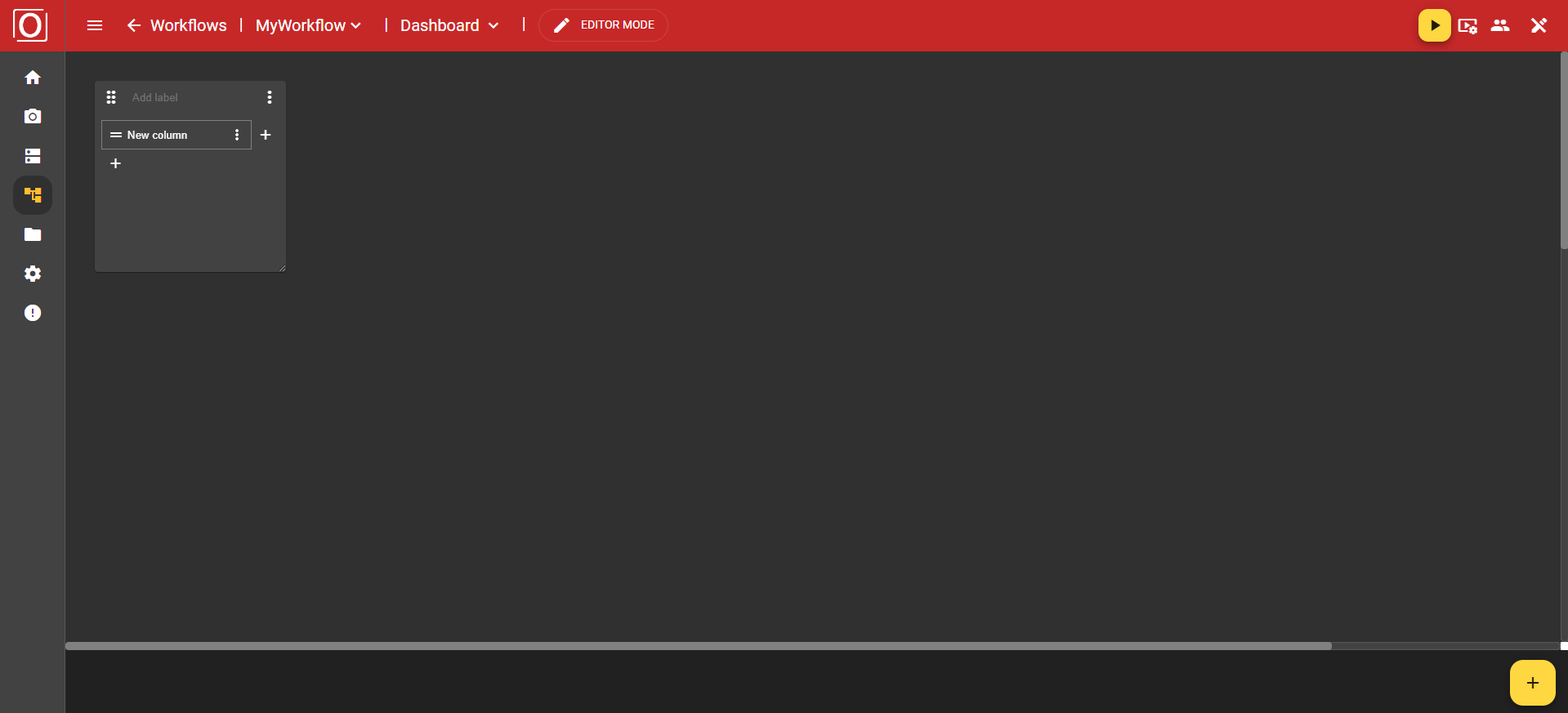
This widget allows you to display data in table form. After adding the widget, it is initially empty and does not yet look much like a table. However, as soon as you start configuring your widget and click the yellow “Add Column” button, the table will begin to take shape.
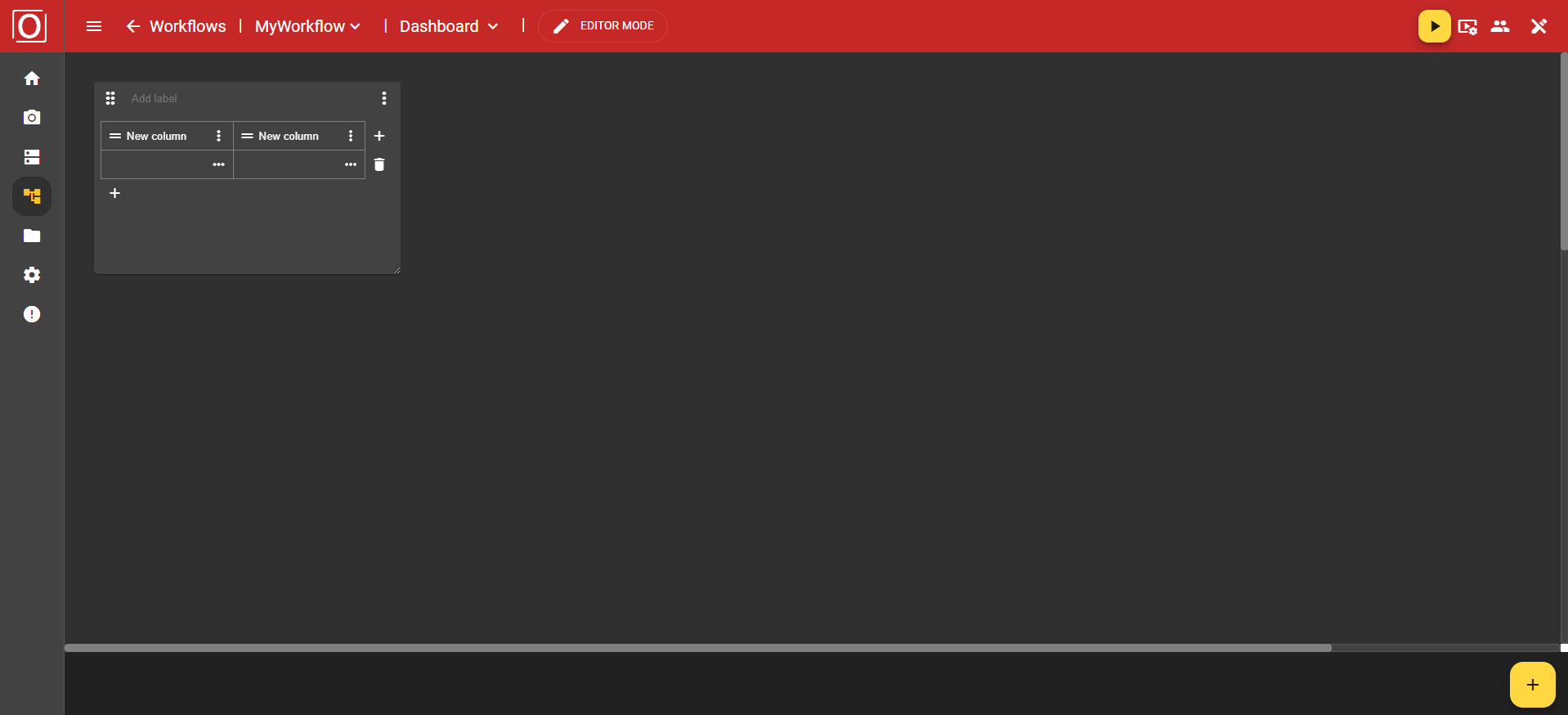
First, an initial column is created. This is also the header row. Here, you can create not only additional columns, but also additional rows. In addition, you can configure or type the column via a column in the header row or the associated menu.
Once you have created a row, you can delete it using the button with the “trash can” icon. To delete a column, navigate to the “Remove” option in the header using the three-dot menu.
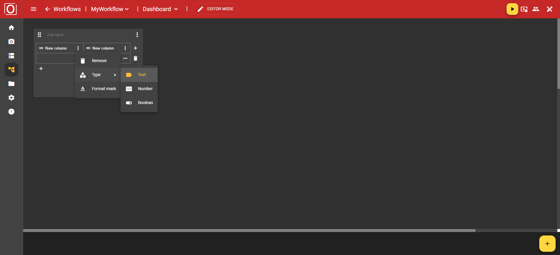
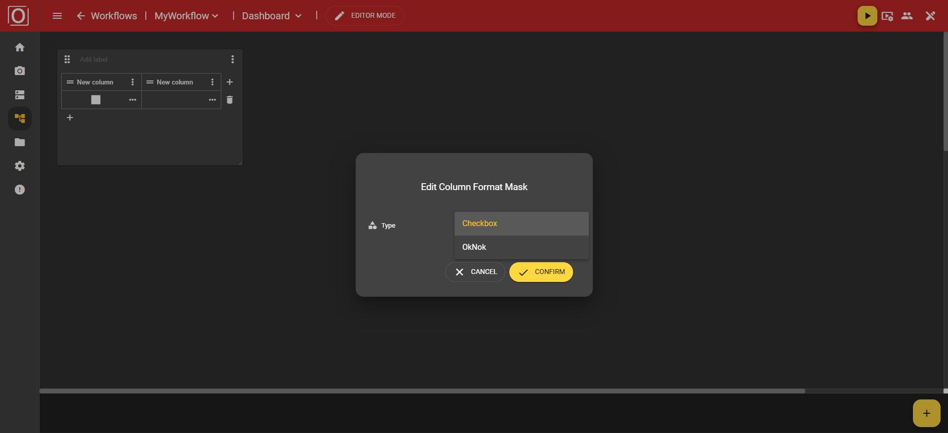
In the three-point menu of the columns, you will find the options “Remove” to delete the column, ‘Type’ to assign a type, and “Format mask” to define the formatting of your values.
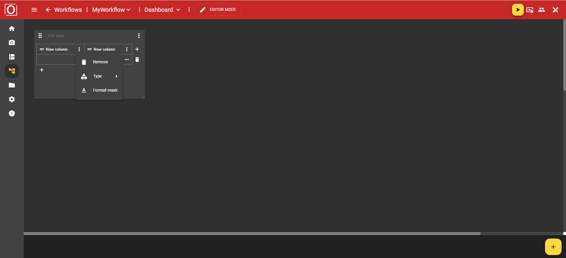
The “Type” option offers you the choices Text, Number, and Boolean.
If you have chosen the “Text” type, you can use the “Format mask” option to specify whether your text should be displayed as a single line using the “Single-Line” value or in a text field using the “Textarea” value.

However, if you have chosen the “Boolean” type, you can use the “Format mask” option to specify whether your data record is displayed as a checkbox using the ‘Checkbox’ value, or whether the information should be displayed in text form using the “OkNok” value.
You also have the option of configuring a cell individually, for example by linking a variable and thus setting it as context.
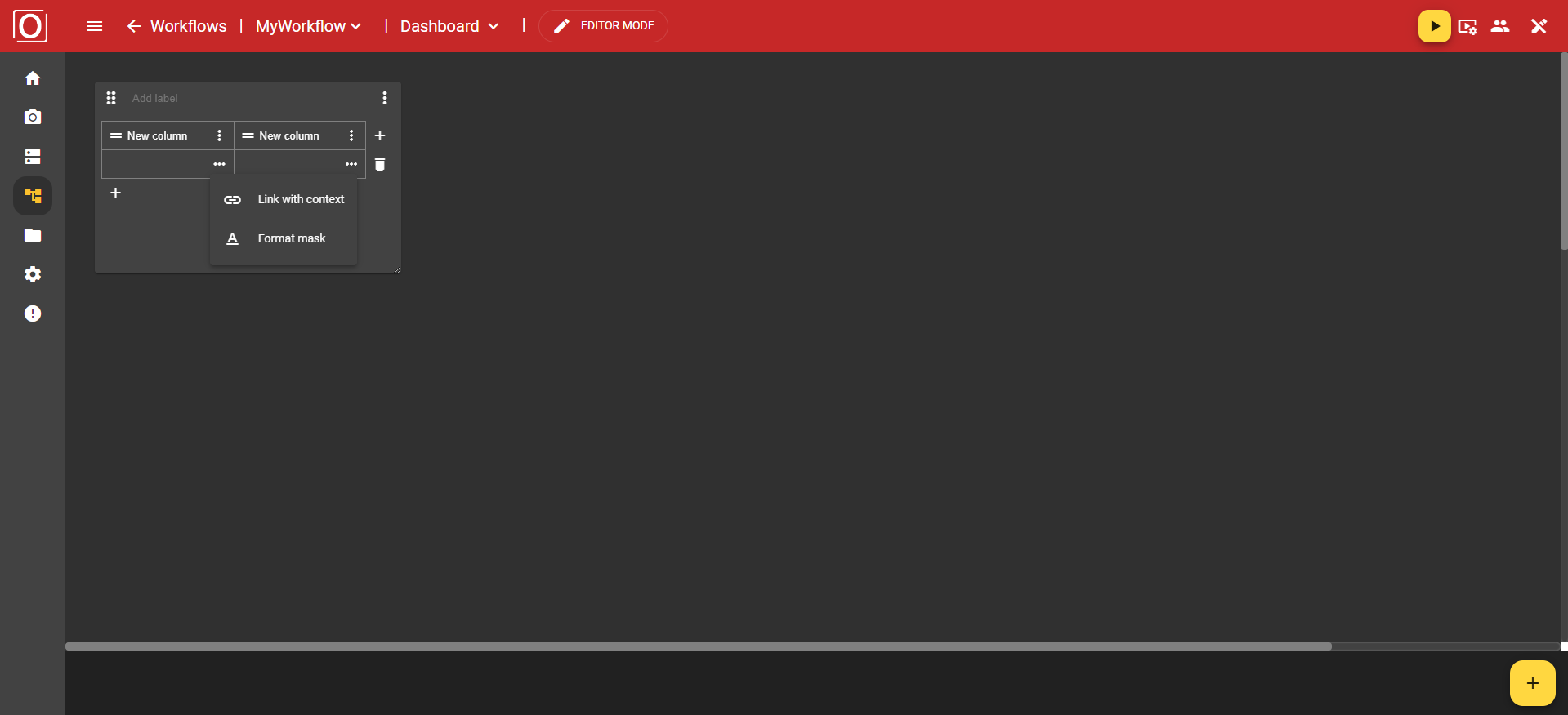
When you click on the “Link with context” option in the menu, the previously mentioned dialog box titled “Link variable with context” appears. All variables of type boolean are displayed there, and you can activate exactly one of them for the widget using a checkbox. After selecting a variable, close the dialog box by clicking the “Confirm” button.
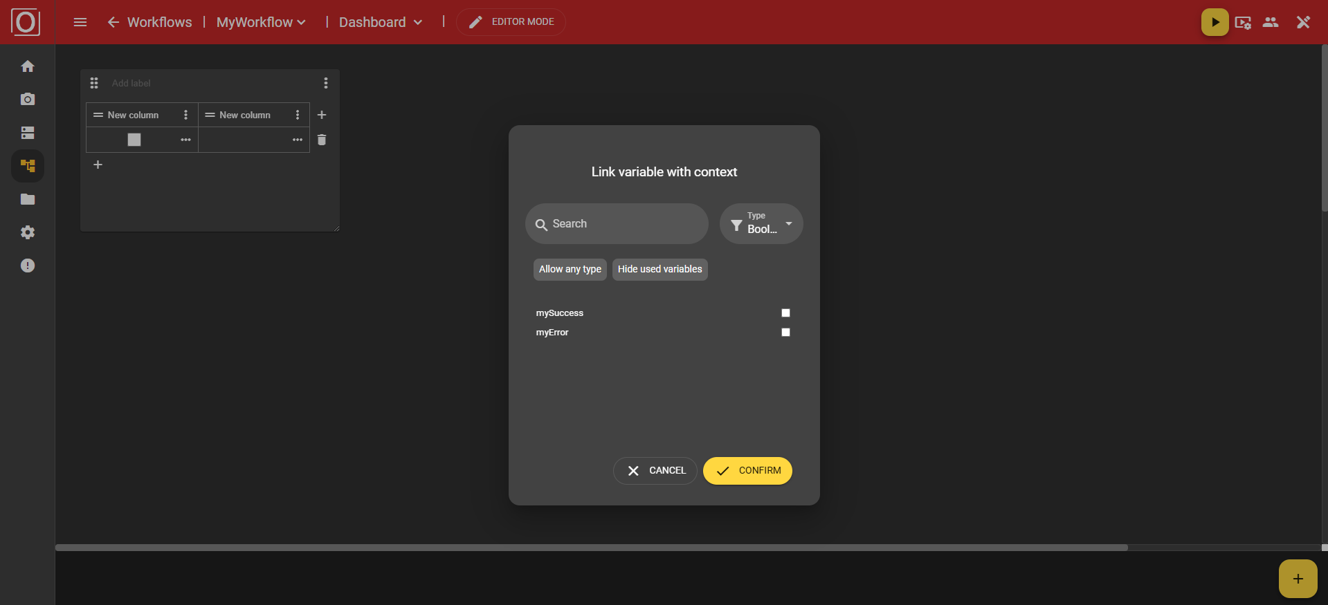
Once you have assigned a context to your widget, the cell will be filled with a value at runtime of your workflow.
iFrame Widget
This widget allows you to embed content from other websites.
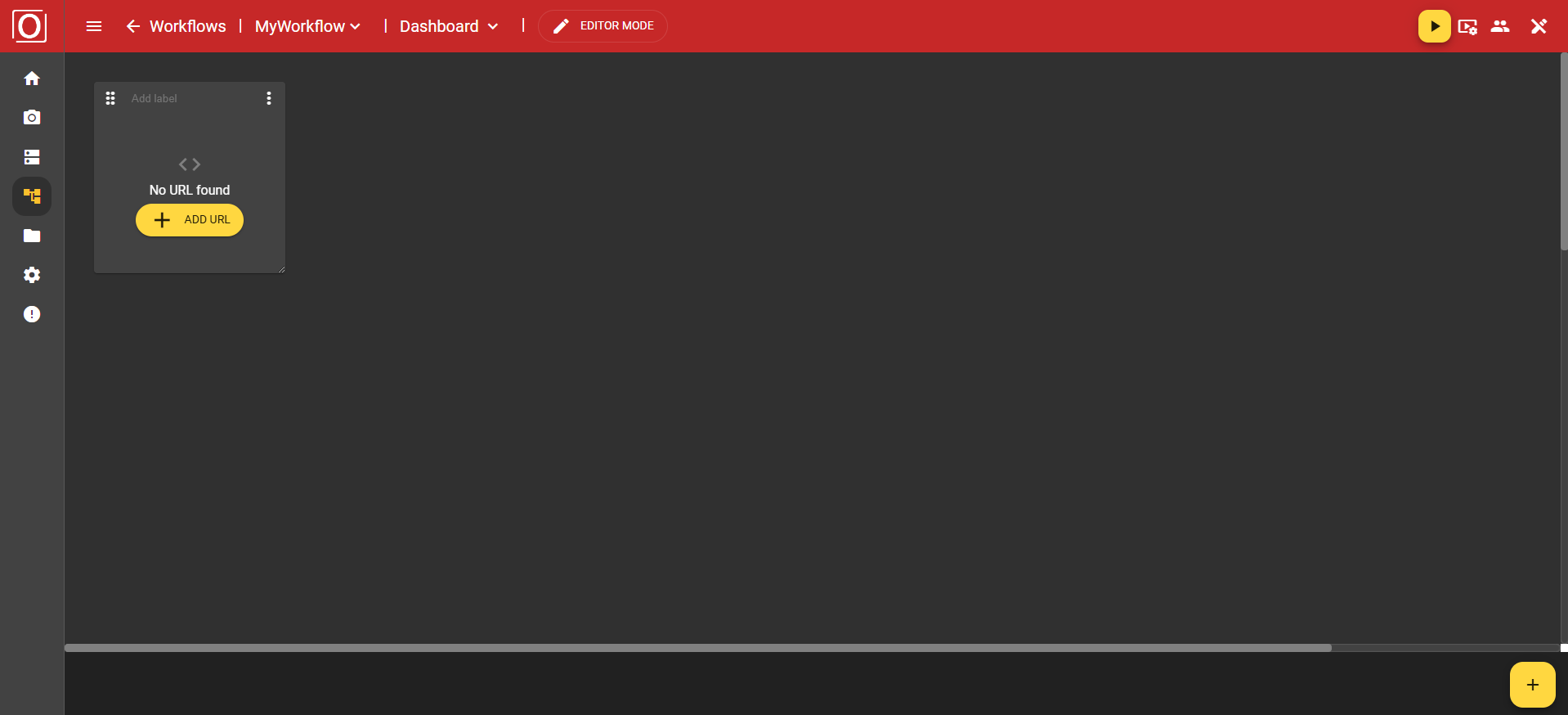
When you click on the “Add URL” button, a new menu opens with the options “Enter URL” and “Link with context.” Let's take a closer look at the “Enter URL” option.
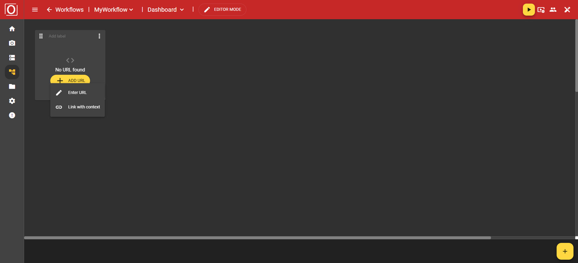
A dialog box titled Edit URL will open. You will also find a text field here for entering your URL. Important: The URL you enter must support https.
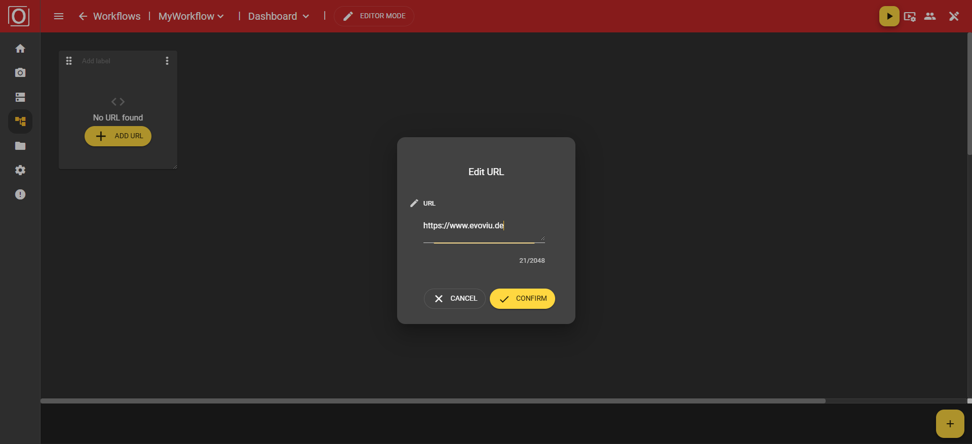
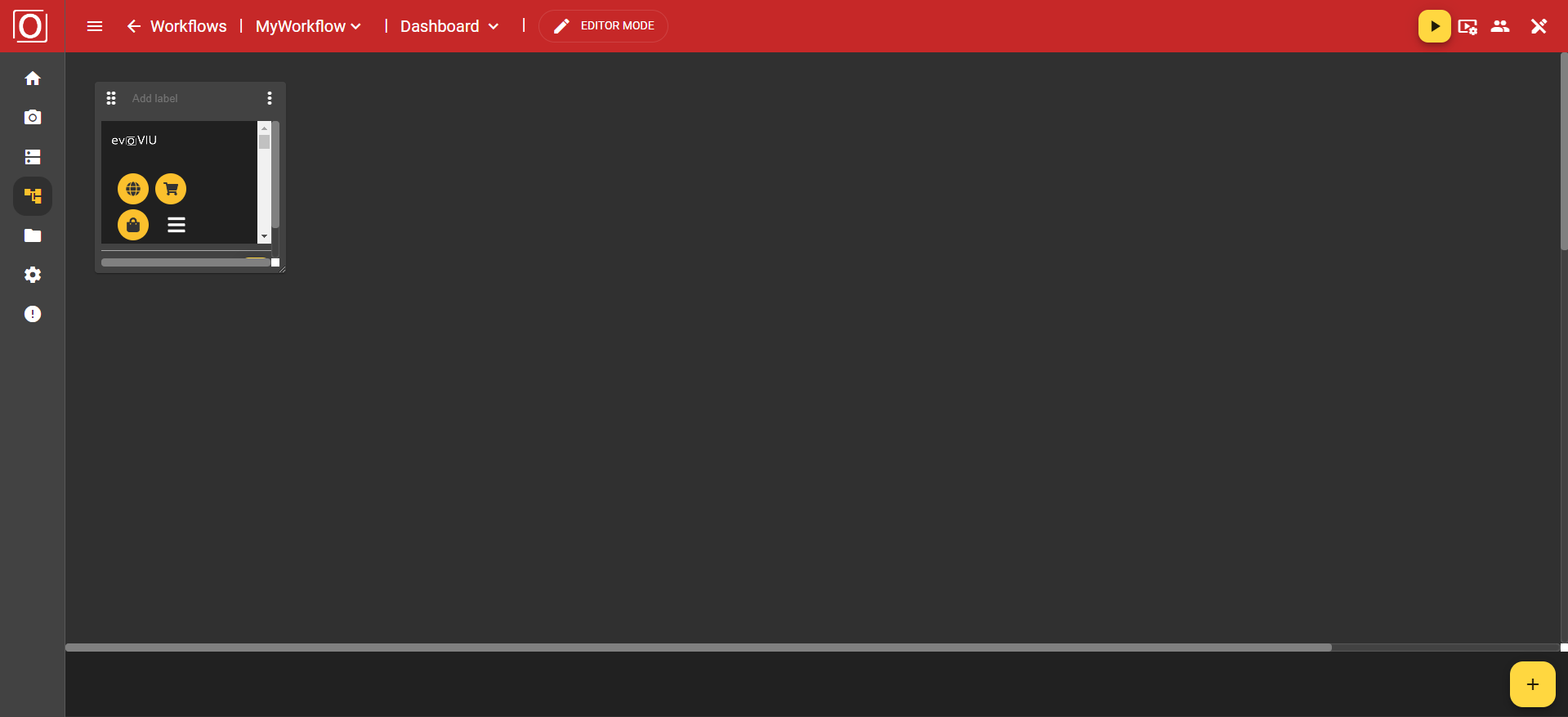
Once you have confirmed the dialog box by clicking on the “Confirm” button, the content of the URL will be integrated into this widget. You will then see the website you entered.
If you want to change the content of your widget, you can use the yellow button with the pencil icon. Clicking on the button opens the dialog for setting the URL to be displayed.
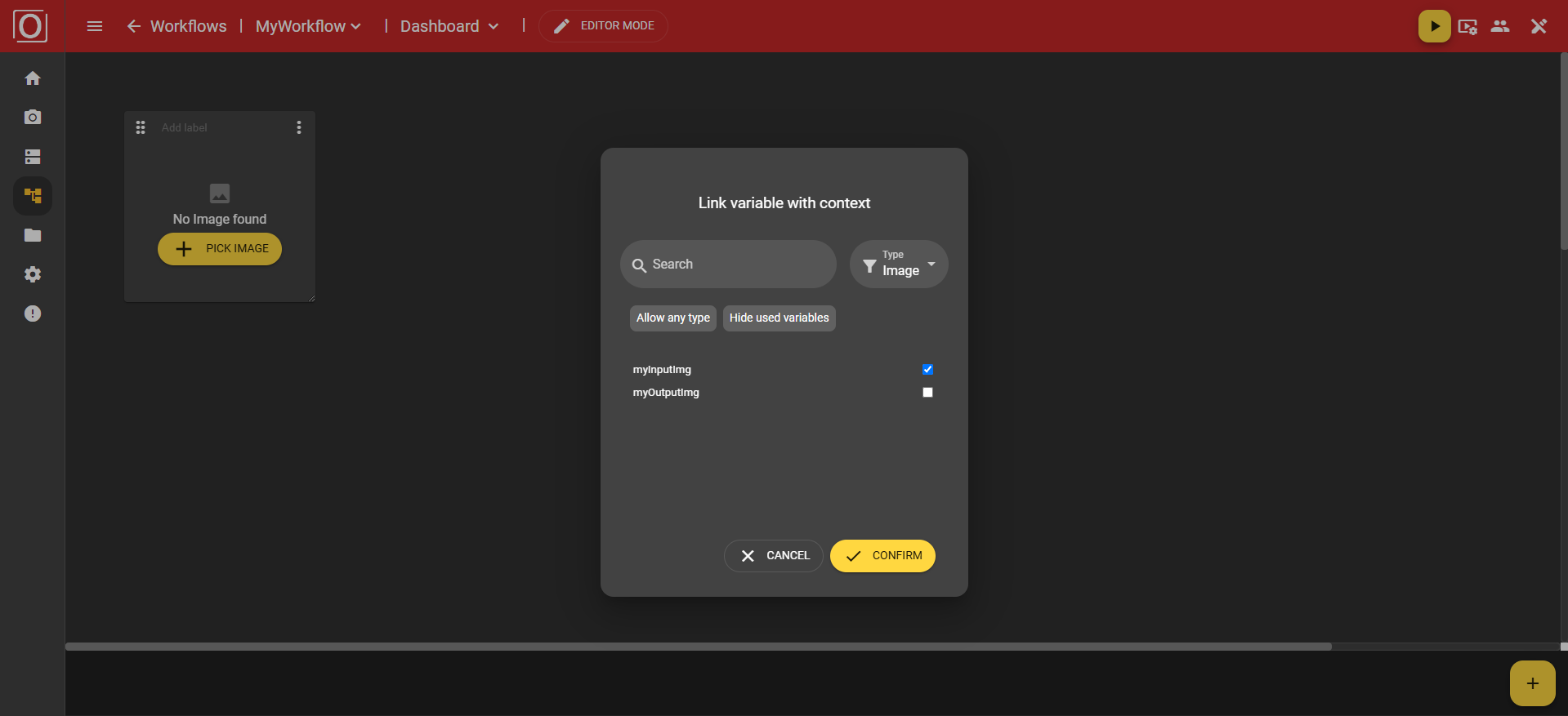
Image widget
Here you have the option of displaying statically stored files from the File Manager or dynamically generated images from the currently active workflow. To display images from the workflow at runtime, you must save the captured image in a variable of type Image and activate the “Publish value” of the variable.
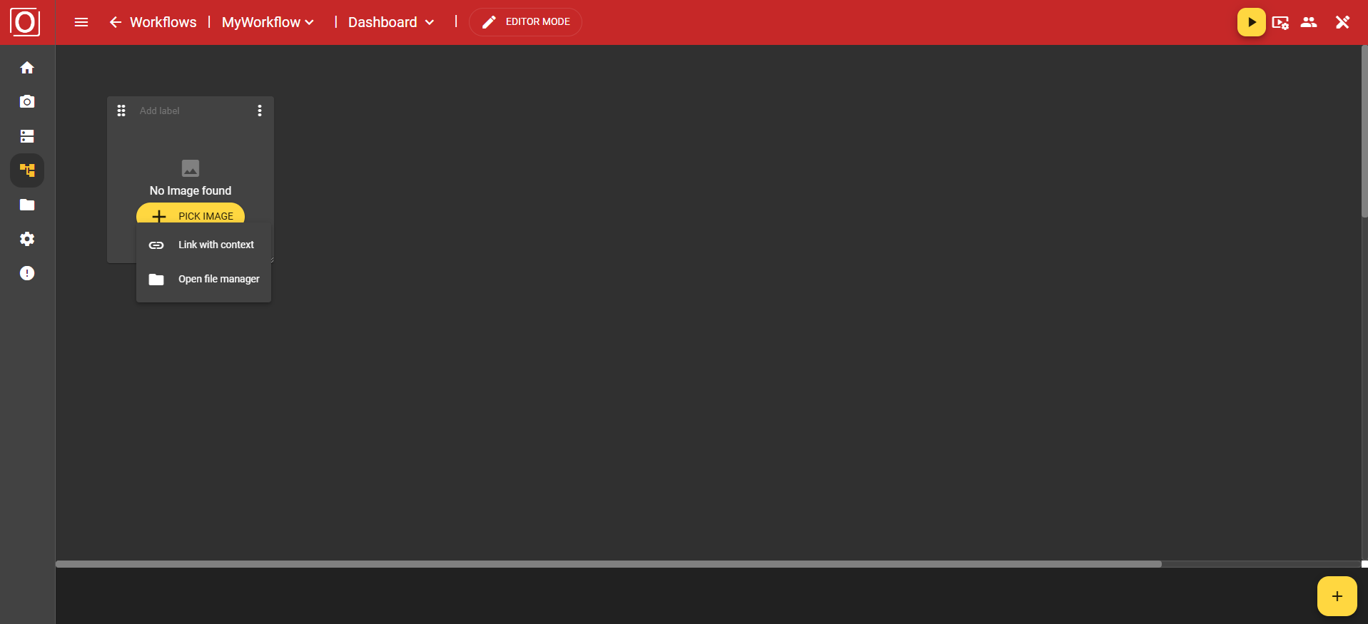
If you now click on the “Link with context” option in the menu, the previously mentioned dialog box with the title “Link variable with context” will appear. All variables of type boolean are displayed there, and you can activate exactly one of them for the widget using a checkbox. After selecting a variable, close the dialog box by clicking the “Confirm” button.
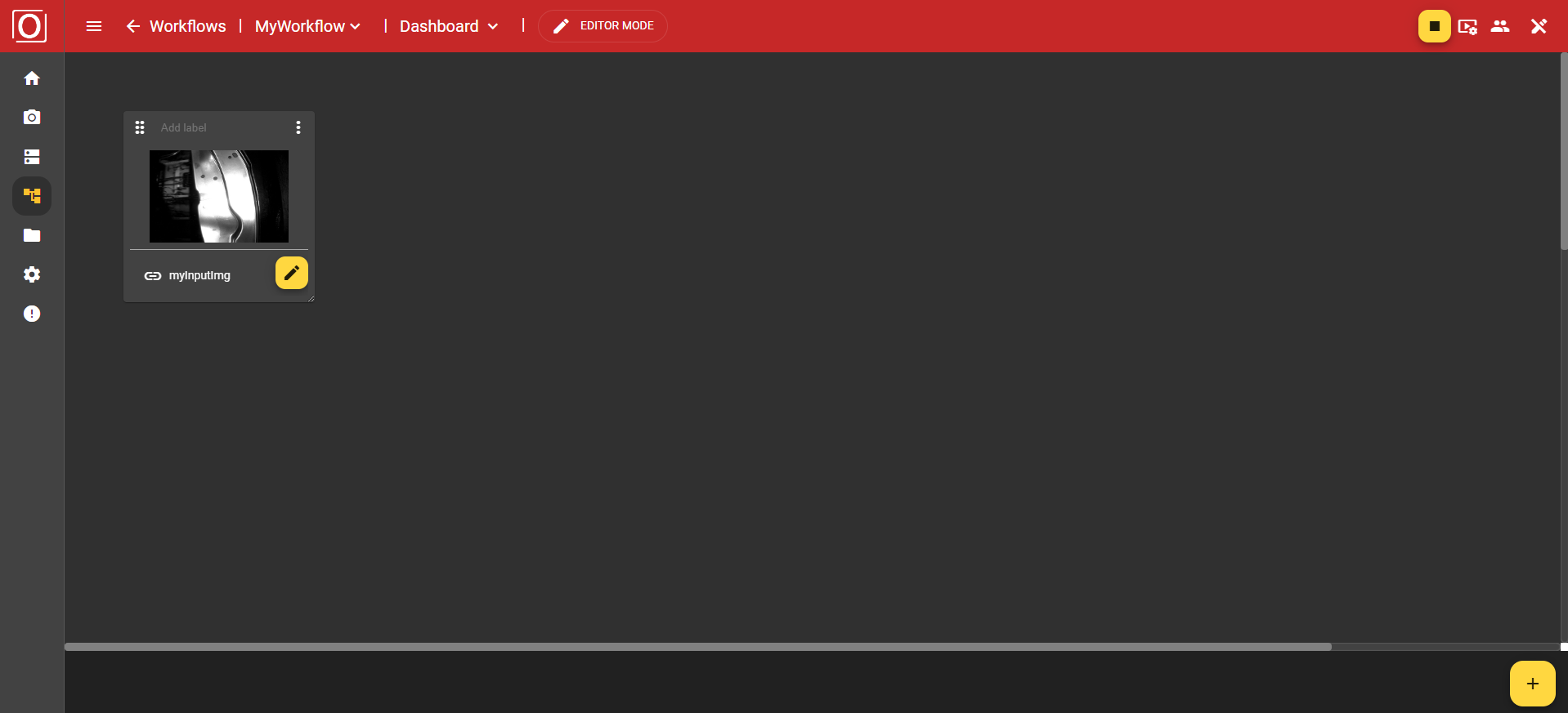
Once you have assigned a context to your widget, the view of your widget will change. You will not only see a changed message, but also a new bar that contains a yellow button with a pencil icon next to the name of the selected variable. Both clicking on the button and the name of the selected variable allow you to edit your selection.

Since your image widget is now fully configured, you can start the workflow. Once the first run has taken place and all variables have been assigned values, the widget will automatically be populated with the content of the variable, i.e., the captured image.
Label Widget
The label widget is extremely simple. It only possesses the basic functions of a widget.
Text Widget
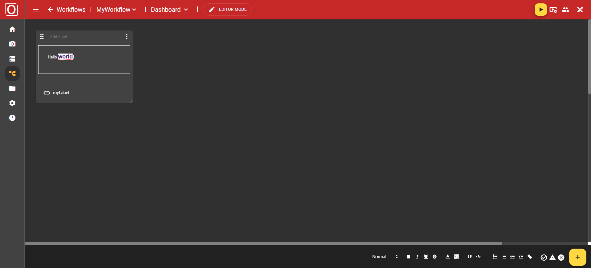
This widget allows you to write and format text, similar to what you're used to from common editors. A text field is provided for this purpose, and its size adjusts dynamically to the widget.
In the dialog titled “Link variable with context,” all variables of the type boolean are displayed. You can activate exactly one of them for the widget using a checkbox. After selecting a variable, close the dialog by clicking the “Confirm” button.
Usually, however, the text widget is used for text input. Here, you can highlight sections, and additional formatting options will immediately appear in the bottom app bar.
The following functions are available to you:
Text size
Bold
Italic
Underline
Strikethrough
Font color
Text highlight color
Quote
Code
Numbered list
Bullet points
Decrease indent
Increase indent
Hyperlink
Info panel (Success, Warning, Error)
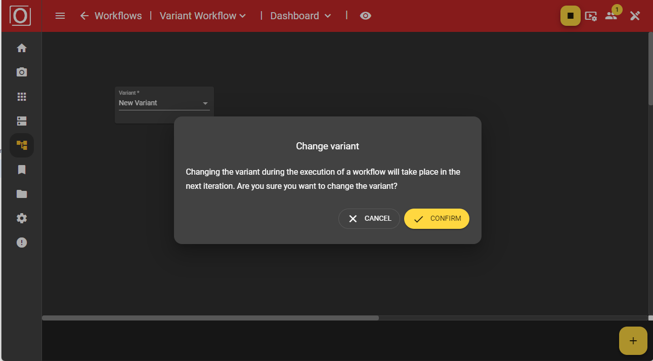
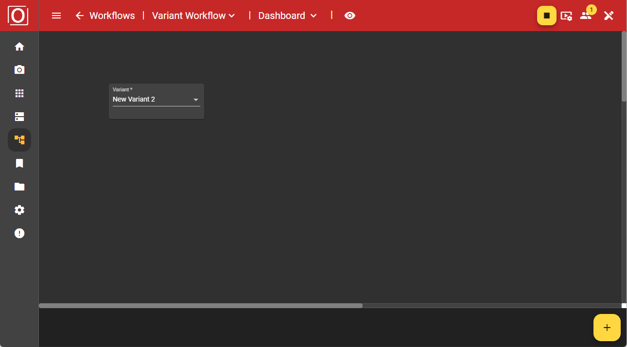
Variant Control Widget
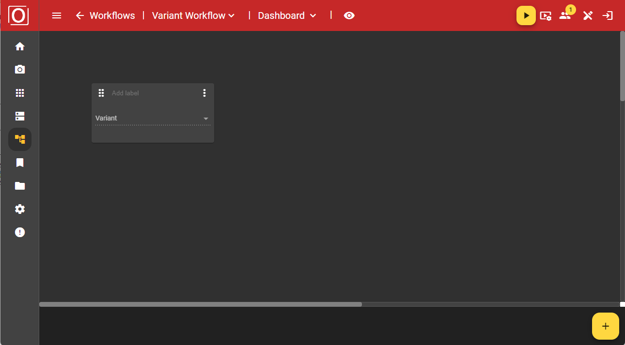
During operation, you can control the variants via the dashboard. The advantage of this is that you don’t need to make any changes to the graph. Simply add the “Variant control” widget to the dashboard using the “Add” button.
Initially, the widget is displayed in an empty state. However, once your workflow is active, you can use a dropdown menu to select the variant you would like to use instead.
If you have started a workflow using a variant, the widget will be populated with the currently used variant.

After making your selection, a dialog will appear asking whether you really want to use the chosen variant, as this will affect your ongoing process. Once you confirm the dialog, your workflow will operate with the values of the newly selected variant.
Variant Editor Widget
Add the “Variant editor” widget to the dashboard using the “Add” button.
Initially, the widget is displayed in an empty state. However, once your workflow is active, you can select the variant you want to use instead via a dropdown menu.
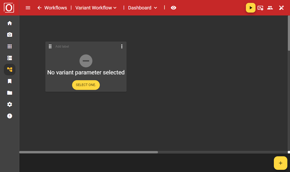
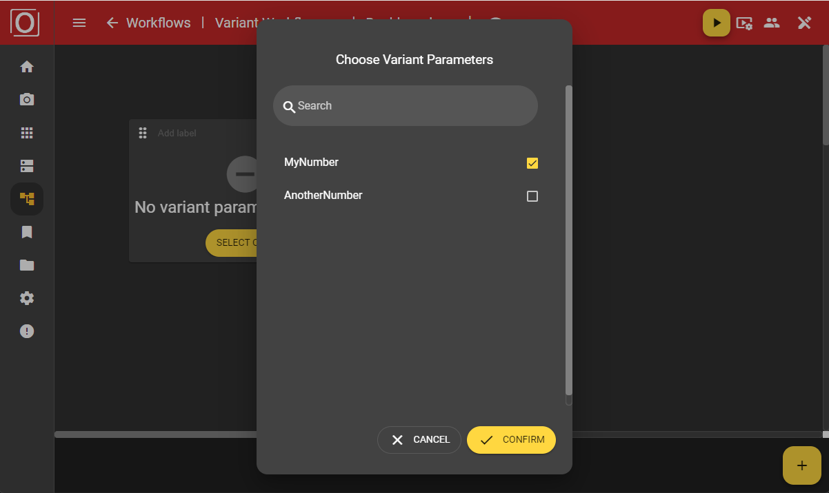
When configuring the “Variant editor” widget, you can select from all parameters marked for variants in a dialog and have them displayed. If there are many parameters, it might be helpful to use the search function.
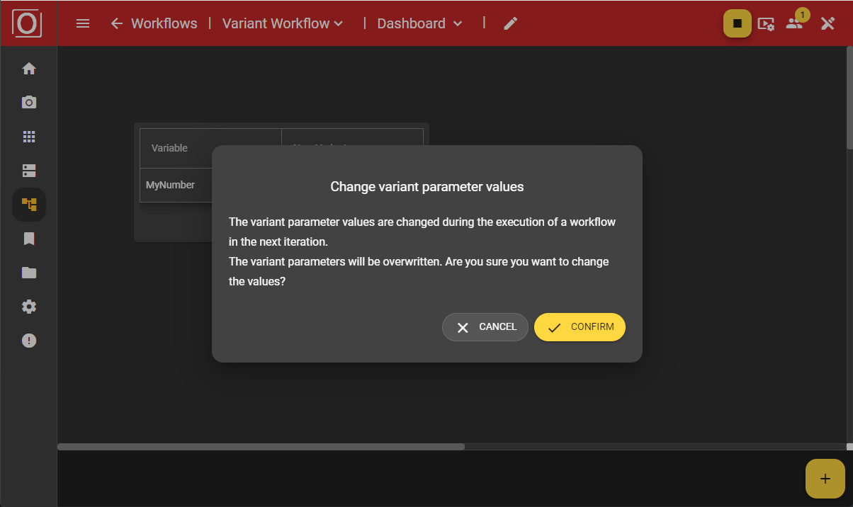
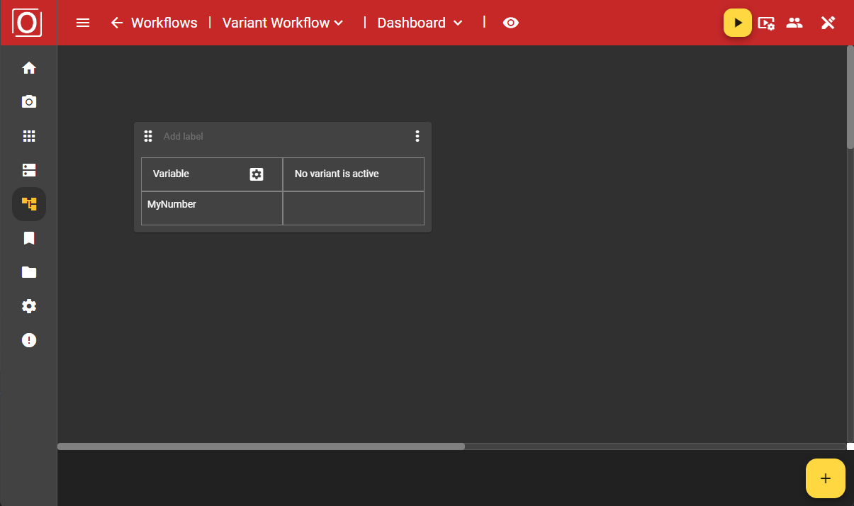
Even after configuration, your widget will still be displayed in an empty state. However, once you activate your workflow by selecting the variant you want to use from a dropdown in the dialog, the values assigned to the active variant will be shown.
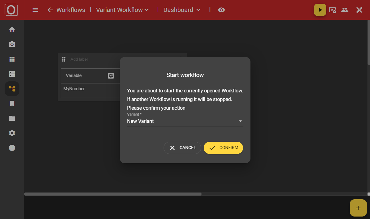
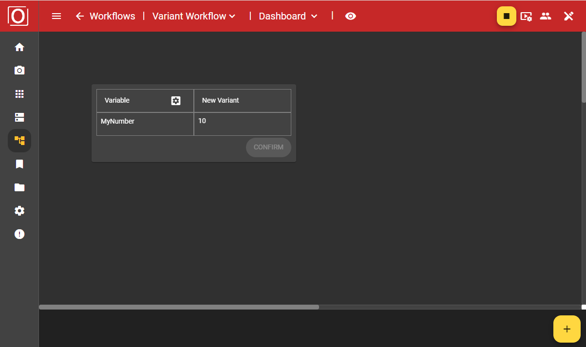
If you have started a workflow using a variant, the widget will be populated with the values of the currently used variant.
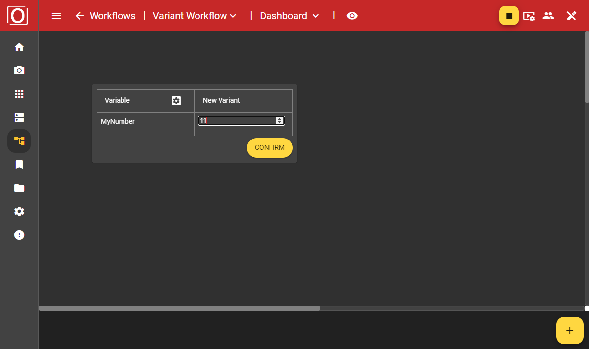
After making your selection, a dialog will ask you to confirm whether you want to use the new values of your variant parameter, as this will affect your ongoing process. Once you confirm the dialog, your workflow will operate with the new values.